The choice of colour
Daroo Photography, Jacob Reischel and Matt Russell produce still life photographs where choices about colour strength and contrast are very important. Martin Parr and Alec Soth carefully consider the colour of props, clothing and background in their documentary studies of people and places.
Some questions:
Some questions:
- Why is colour photography so successful in advertising? Why have (art) photographers been suspicious of colour in photography until quite recently?
- How does colour affect our senses? How do colour combinations work?
- How can photographers use colour theory to help them compose/construct their images?
- I think that colour is so successful in advertising because colour draws people to things, things that are colourful or bright tend to be more attractive, used in the right way colour can change how appealing something is and who it draws to it, for example, baby toys tend to have very primary, soft, easy colour as babies will find this nicer as they can understand this easier. On the other hand an adult can still be attracted to colourful things however more mature colours, venturing into different shades and tones, this can attract or turn away a persons attention in seconds.
- I feel as if people have been scared to venture into new colours in advertising is because it can go very badly wrong and actually make people not want to look at or buy something. I think that with modern influence, colourful and bright things have raised in popularity, especially in advertising, due to common demand people have developed a liking for colourful imagery and advertising as it is now seen as attractive and aesthetically pleasing.
- Colour affects our senses in a few ways, one way being that we associate colours to items for example, red some people associate with strawberry and white with mint and coolness so when we see certain colours we will think of the smell, taste and texture of certain items. Colour combinations are interesting to work with as finding colours that work with each other and colours that don't is quite fun, this isn't just certain colours that work together it is more complicated than that, different tones of colours make a certain combination, when you go to paint a house you might see a colour chart and it will show certain colours and tones that work together. Tones are a big part of colour combinations, as this means that colours can work with themselves like a very neon bright blue and a very dark navy colour won't really work with each other.
- Colour theory is the theory that images can either take a raise in popularity or drop in popularity due to colour in an image or product, people like colourful things however, there is a very fine line between to much colour and just enough, this is why it is seen as risky and has been up until recent years, you can make an image very good with colour or completely ruin an image. I think that artists and photographers use this theory to their advantage and try to take risks that will make their work better and more aesthetically pleasing.
Why I Chose The choice Of Colour
I chose the choice of colour because this is the only topic other than texture and discarded items, with discarded items I have already sort of explored that by doing a rubbishes point of view and I really wanted to to start something new for component 2. With texture I feel like I have already explored texture through images and if I choose this the pictures may just end up looking like my old images and I want to start something new and fresh.
Artists Who Take a Lot Of Consideration Into Colour
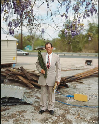
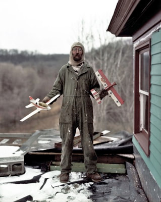
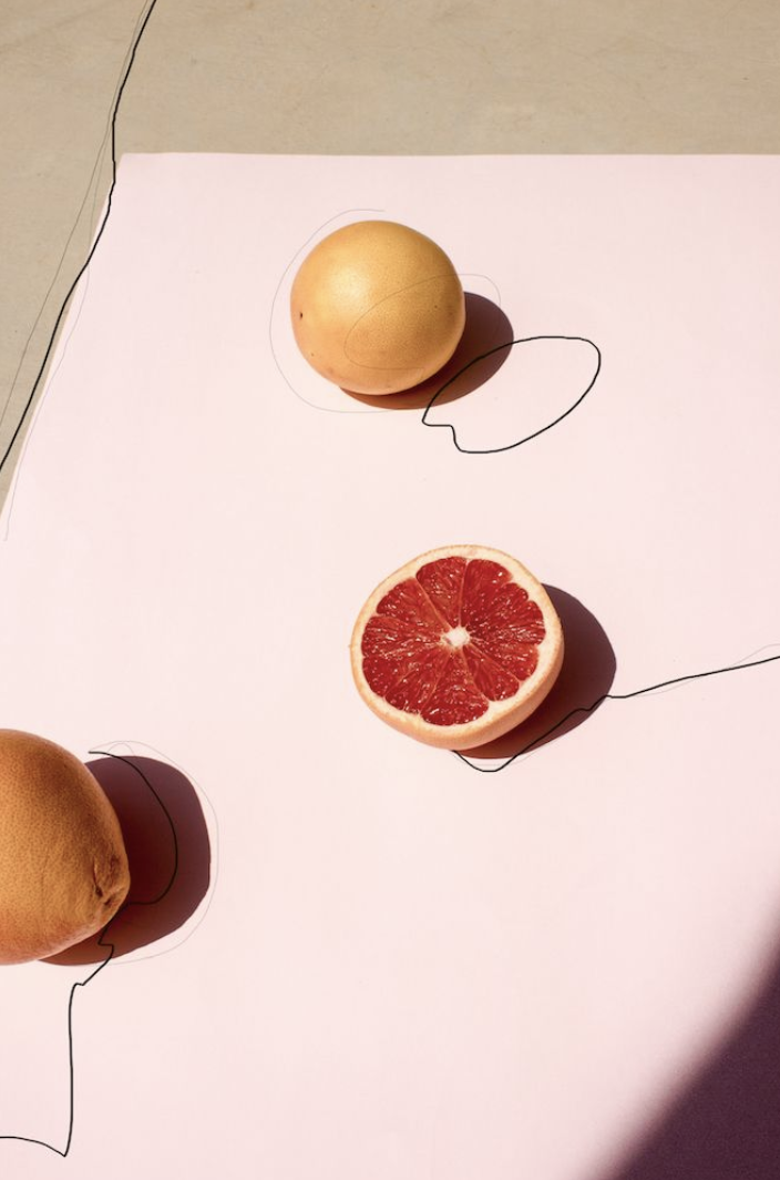
Alec Soth : Alec Soth is my first artists who I have been looking at, his images often explore the relationship between a person and a place especially in his book Sleeping by the Mississippi, in this book he travels down the Mississippi taking pictures of individuals who live on the outskirts of urban civilisation. My favourites out of his books is NIAGARA: The colours that are used in his images I would describe as being smooth and easy on the eye, he will often have two matching things in the image with matching colours. The story behind NIAGARA is that there is a beautiful waterfall and scenery but the village around it is very ugly and not so beautiful, which I find interesting because the colours he uses aren't really vibrant and bright like you think, they are more bland and sort of like in-between colours. Another one of my favourites is Sleeping by the Mississippi this book definitely focuses on individuals and their relationship between them and where they live, what they do and their general lifestyle.
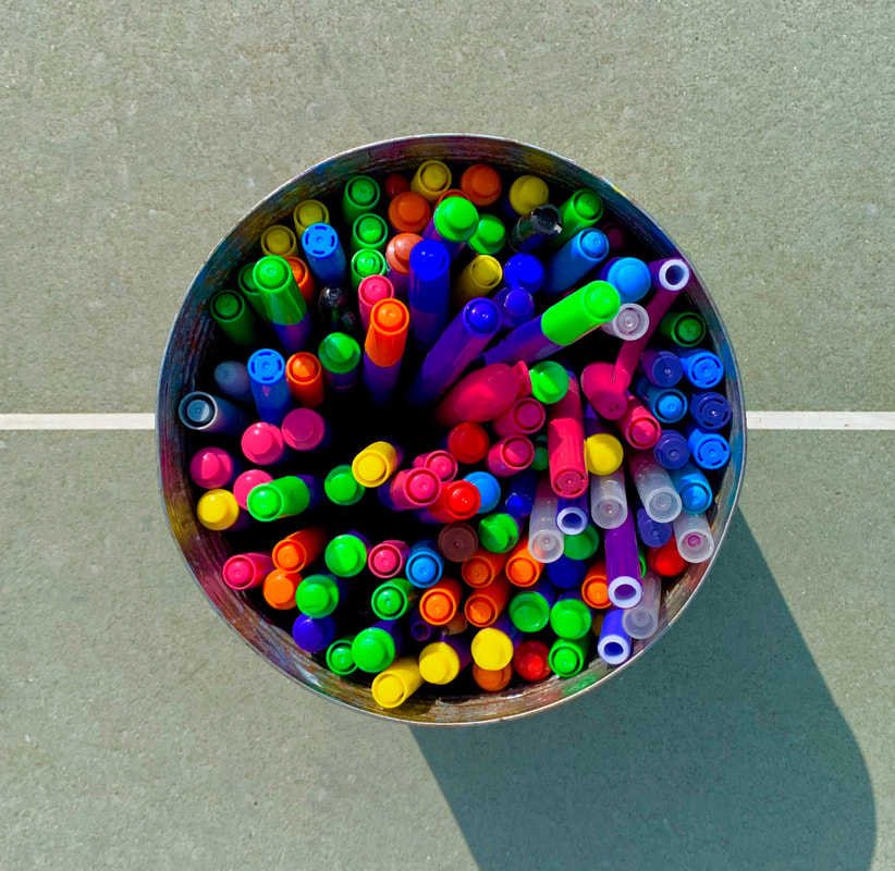
Daroo Ulises: Ulises obviously pays a lot of attention to colour in his images with some of his pictures just having coloured pencils in a certain order, just to show the bright vibrant colours. I think that in terms of colour in his images with some of them he shows the relationship or the distinction between a set of colours, I don't think that colour is the only thing that he takes into consideration shadows, reflection, shapes and framing, all of these contribute to the way the colours look and work.
jacob reischel: This photographer often makes images that blend colour and some that really contrast, there is no in-between. The theme of his images I would say is random objects because his pictures are strange, the framing is another key part of his images.
videos relevant to the choice of colour
Alec Soth images
These images are focusing on individuals, random pictures of average people who live their normal lives, these images are very effective as it gives you almost an insight into these peoples lives. The style of the images are slightly like a school picture, like mugshots of people that are living life, these isn't anything special about these people but at the same time there is and that is the point, each person is different which you could say makes them special.
My images inspired by Alec Soth
these images are not entirely meant to be the exact same as Alec Soth's image. I tried to focus on a few main elements of his work and that was his choice of colour, this is the most obvious that I need to focus on the most, recurring colours are orange blue and green, the images above are the unedited versions, I wanted to choose a few that I could take time to edit and do certain things with. Another theme that I used in my images that was inspired by Alec Soth was portraiture and the way that he uses it. I tried to make a sort of abstract portraiture theme that I think is my own style of photography whilst also being very similar to Alec Soth's images. Abstraction is one of the most important parts of these images, I think that it is a very good skill to have in any creative subject, being able to go from two extents, especially mixing two together like abstraction and photography. I feel as if these images went well considering it was my first images of this section.
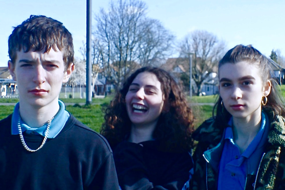
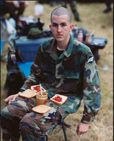
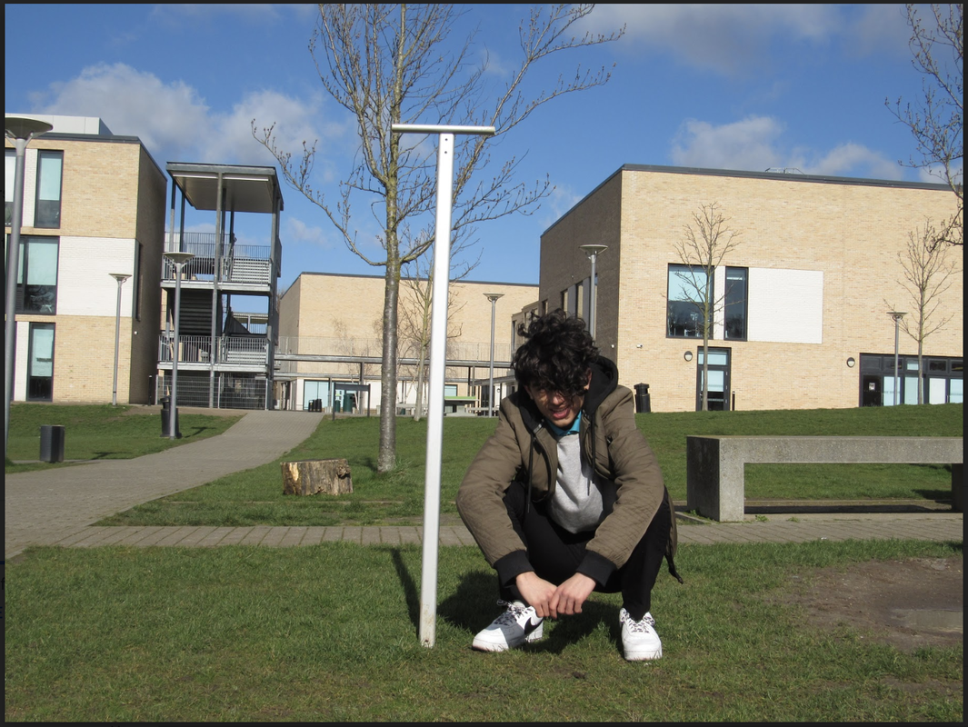
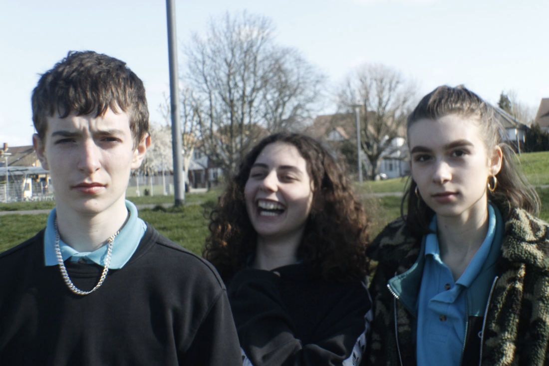
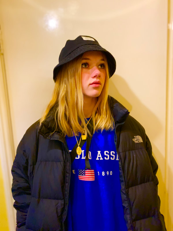
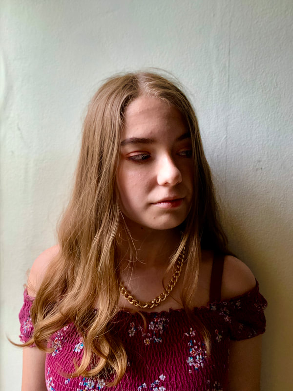
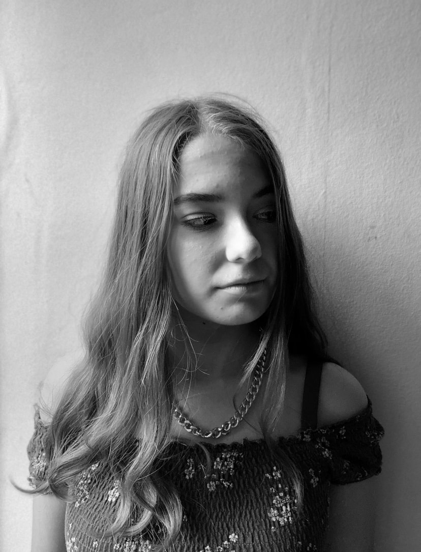
This picture is a picture of three friends two of which have a straight face and one is laughing uncontrollably, in my opinion Alec Soth's images are sort of images that make you ask questions like who are those people?, why are they doing that?, where are they?, pictures that don't really make sense but then again no justification is needed.
I think that this picture is similar as it has no context like Alec Soth's images. I tried to make the over all tone in the colour of this image as being a cold blue colour, I think that the whole picture has a tone of blue with a very low level of warmth compared to the rest of the images, with the colours being very pale and white.
I think that this picture is similar as it has no context like Alec Soth's images. I tried to make the over all tone in the colour of this image as being a cold blue colour, I think that the whole picture has a tone of blue with a very low level of warmth compared to the rest of the images, with the colours being very pale and white.
WWW
I think that editing this image went really well, I wanted to make a really cold image that almost looks blue, this is slightly different from the original image, in this I have slightly highlighted the colour blue in the image making the whole image have a very cold blue image. I think that it is a very interesting image that doesn't make sense, two of the people have a straight face yet one is laughing hysterically, why is she laughing? why aren't they laughing? why are they so serious?
EBI
I feel as if the image could have been more focused and that the quality of the image could have come out better and that it looks like the focus wasn't quite right. I would liked to have taken more images of the same three people with different faces of different positions just in the same place that it was taken from in the first place.
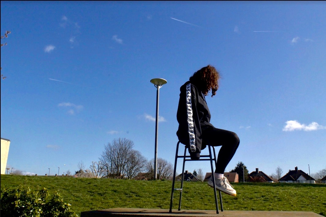
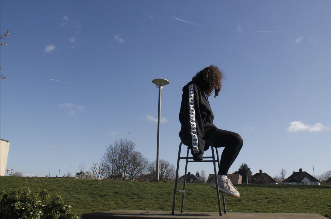
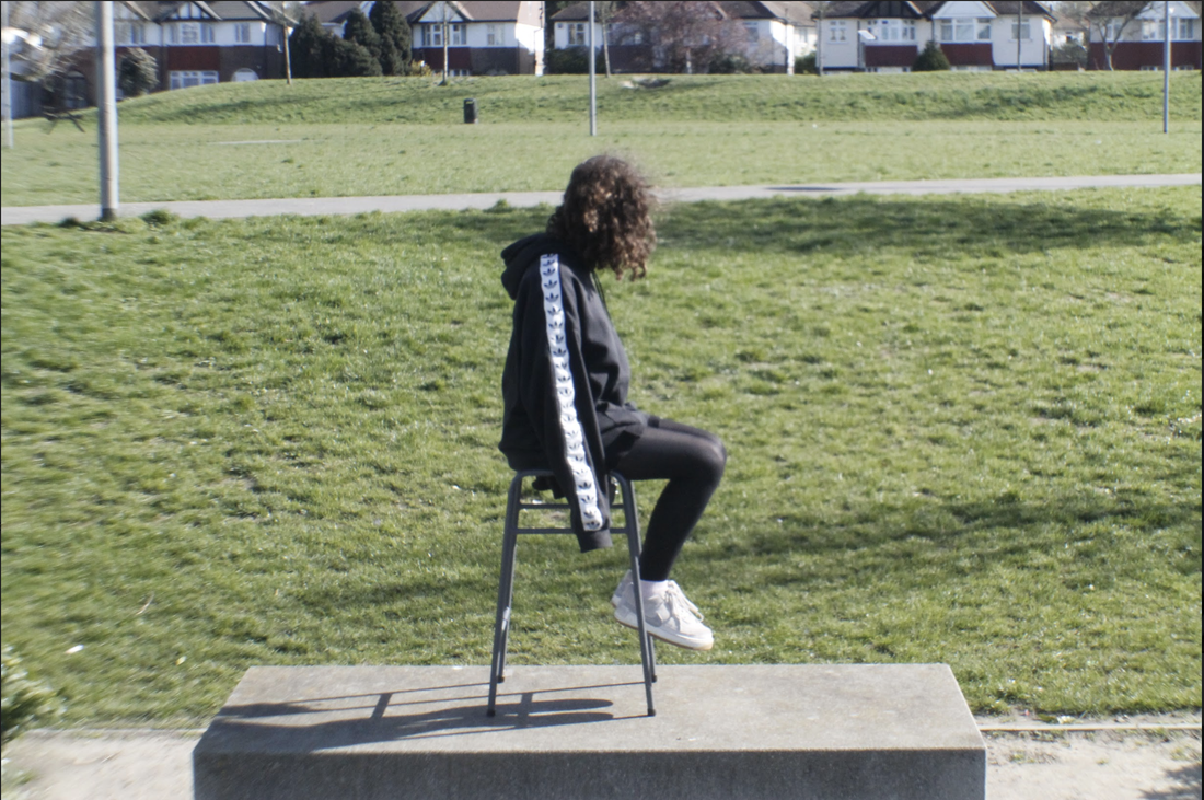
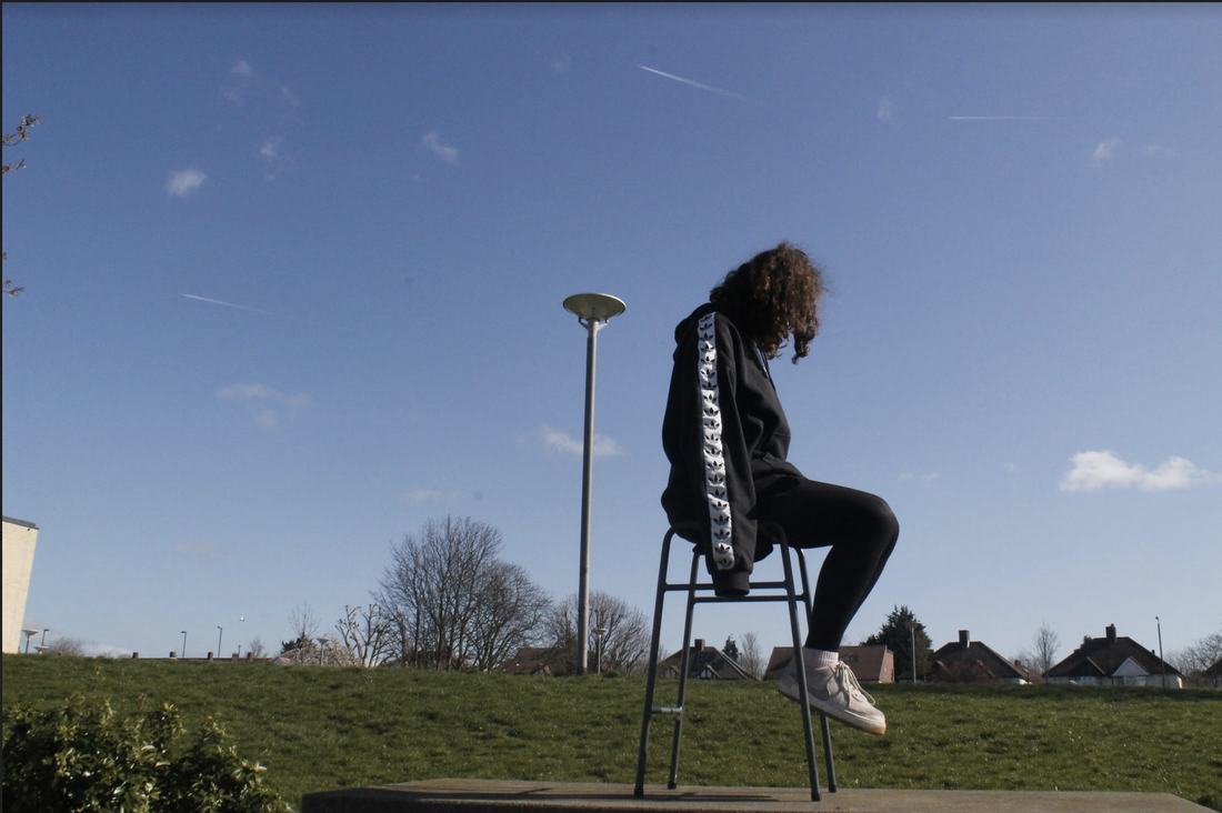
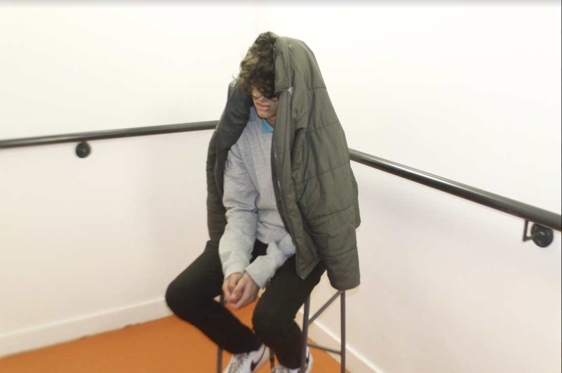
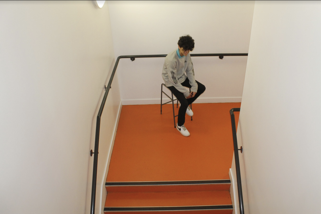
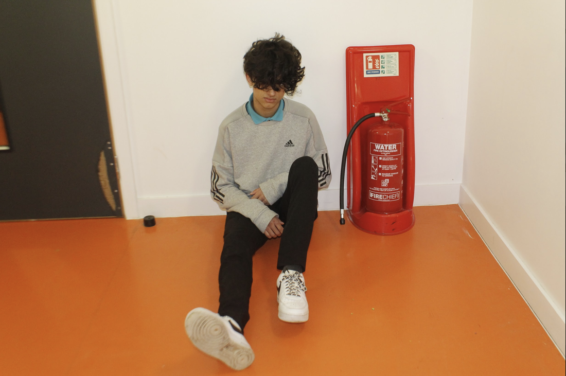
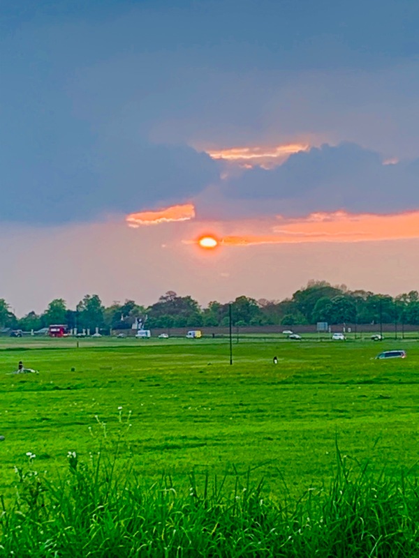
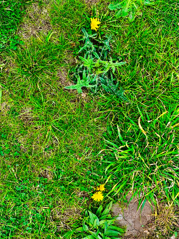
For this image I wanted to try and make a more abstract image, the similarity is that this has no context, in and of itself it doesn't even really make sense, in that it is a very strange picture and that is what I wanted to make out of this picture, I thought that it might be a good idea to have some of the school in the back ground and also some of the field as well, the main thing is the sky though, the big blue sky was the main focus for the background. You know that the person in the image is there and that the place is probably a school that she goes to and that is all you need to know. For this image the way that I used colour is through contrast between the black hoodie and tights and the vibrant colours of the sky and grass, the sky and floor are very bright and very distinct in colour, the grass is very green and the sky is a really light blue, this really contrasts with the black clothes that she is wearing.
WWW
My favourite part about this image is the angle is was taken at, I think that it captures her and whats in the background really well, it captures the sky looking really big and I like that because it is almost like a big horizon of blue. The foreground has kitty and she is almost like a blacked out person, all of her clothes are black, her hands are in her sleeves and her hair is covering her face, you don't see who the person sitting in the foreground is
EBI
This could have been better I think if maybe more of her shadow was in the picture and her shadow played a larger role in the image. Buildings I feel were a important part of the image and I think that more of the school building and the houses over the fence could have been in this image
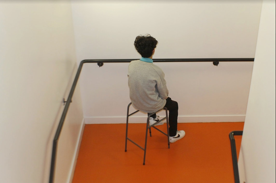
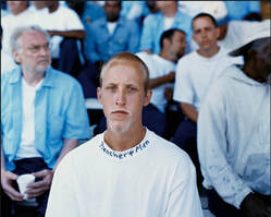
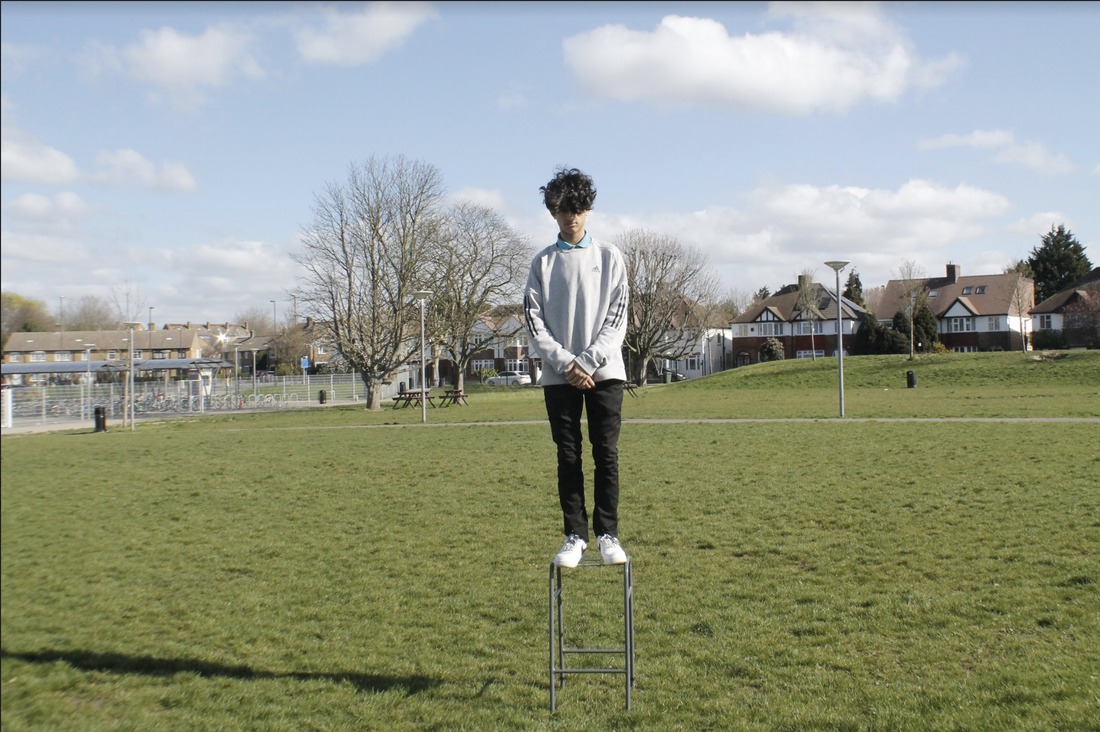
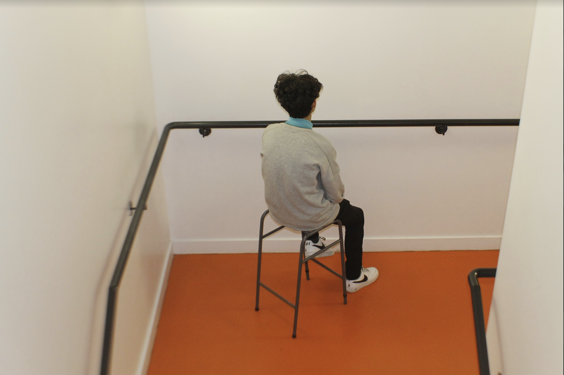
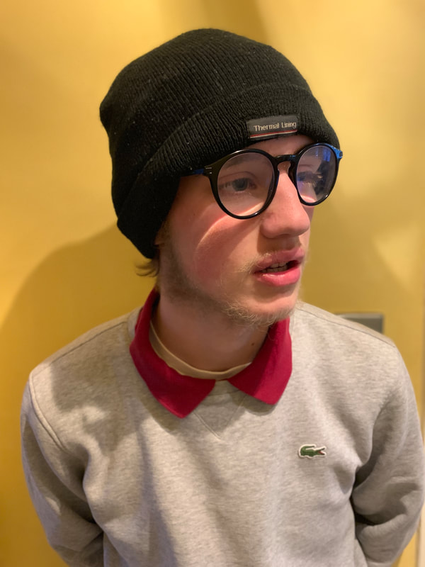
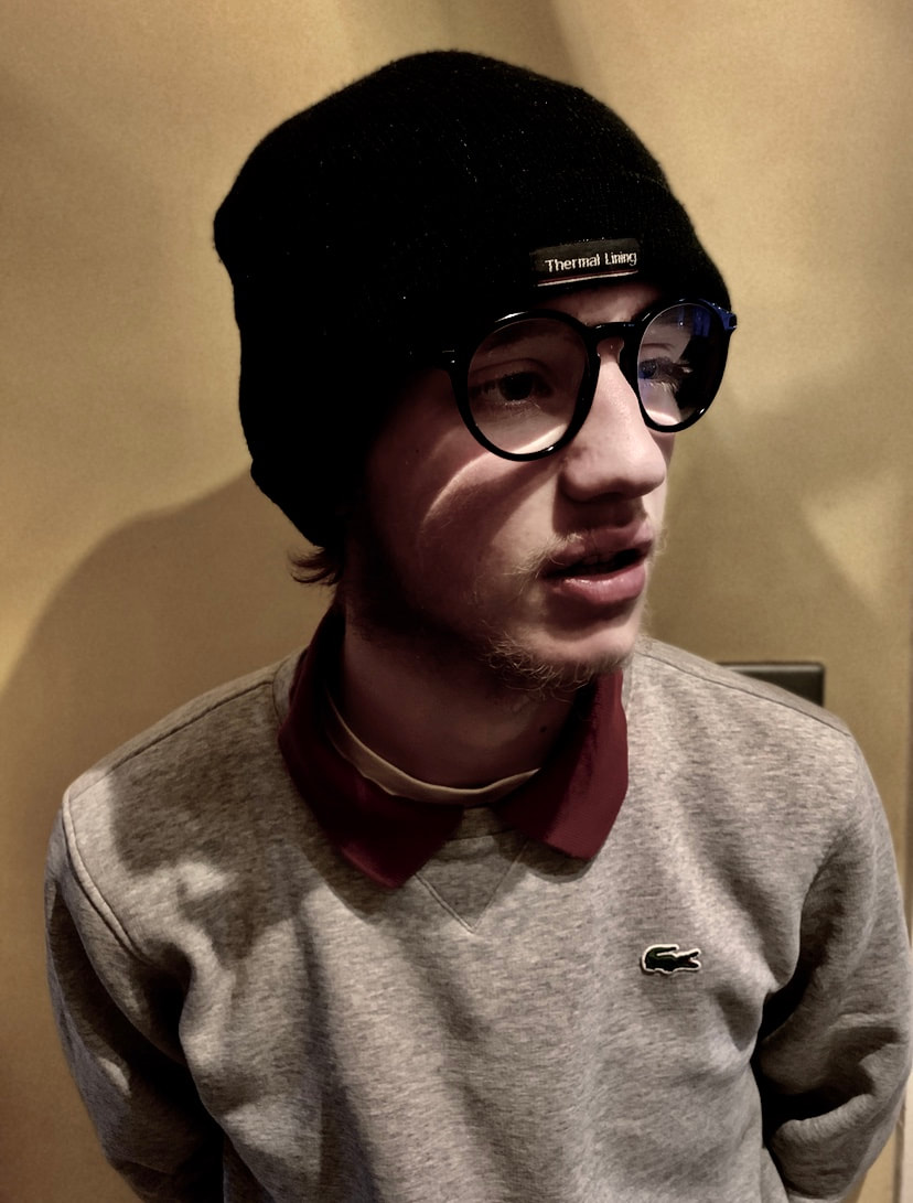
For this image I wanted to get framing the same as Alec Soth's images, I wanted to have a full body shot with a very central focus, this person is in the middle of the shot and everything around him is a matter of three colours, orange, black or white, this makes the main focus not only of the camera but whoever is looking at it the centre where the person is sitting. Another thing that I tried to get at again is the abstract style, again all you can really tell from this picture is that it is taken in school as you can see his blue collar which also shows that he is a student of the school. For this image I think that in the theme of 'the choice of colour' I tried to make the picture very saturated and orangey, I think this is apparent due to the fact that I purposely tried to make it so that the rest of the colours in frame apart from the vibrant orange seem very dull and lifeless.
WWW
I think that my images went quite well, they are interesting to me because I took aspects of his pictures and put them in my own, this I think is better than taking a few pictures that look the exact same as his images.
EBI
I think that this could have been better if I maybe payed more attention to his style instead of just aspects of his work, I did focus on style however I think I could have done more-so. Style is the biggest part of what makes a photographers work their work, so I think maybe if I could have just tried to use his style a big whilst not being too similar to his images.
Daroo Ulises
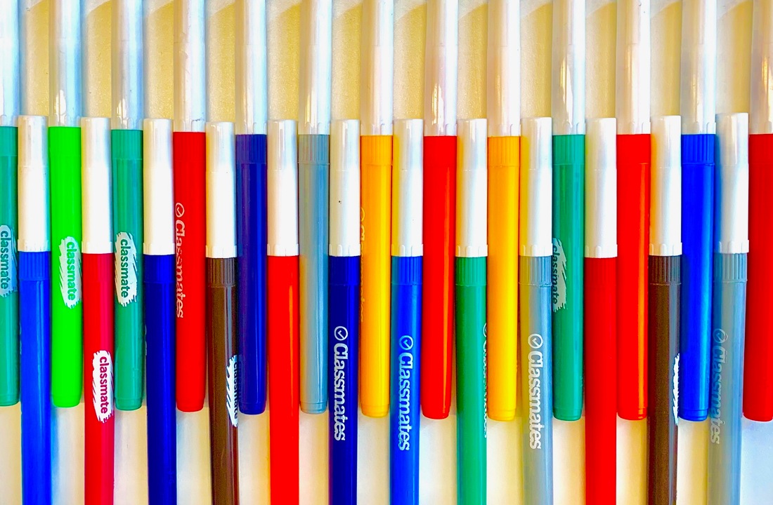
Daroo Ulises is a photographer who photographs every day objects like pencils and buttons, they tend to be vibrantly colourful and aesthetically pleasing due to the primary colours that we all know so well, that is why the images look nice because we are so used to them and they are so simple. his images of the everyday objects will be different every time, like with the pencils, he might arrange them in a certain order or in a certain shape that is pleasing because they line up so perfectly, he combines simple colours with the difficult task of arranging them in a certain way.
Daroo Ulises images
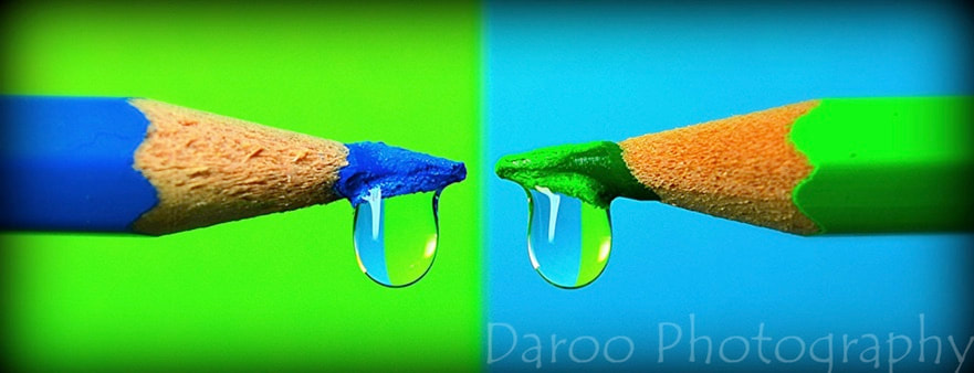
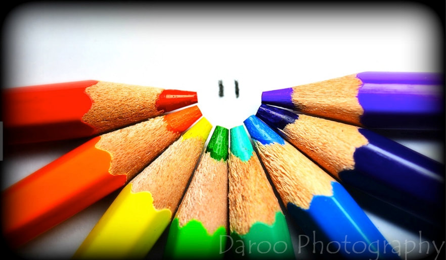
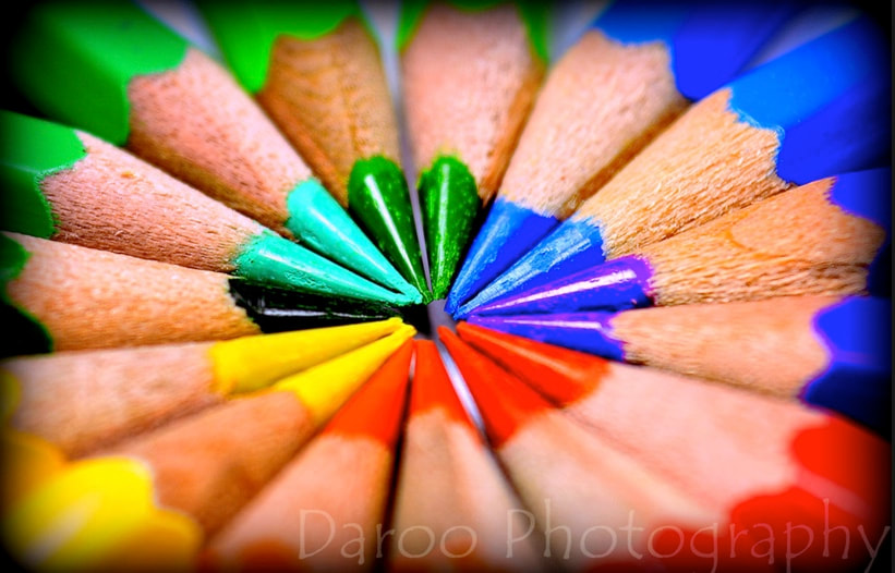
These are some examples of his images and the sort of colours that he uses including landscapes and still life, I can say for myself that I like his still life a lot more as I think that they look better and more interesting. Aesthetically these images are very good and I think that he has a very good style, he uses very strange techniques that most people wouldn't use.
My pictures inspired by Daroo Ulises
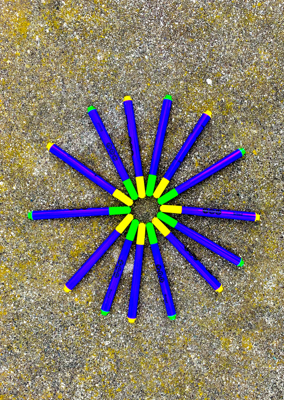
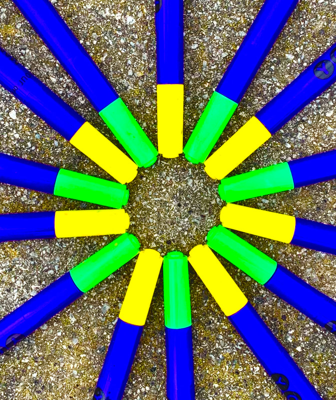
These are images that I have taken only bright vibrant colours into consideration. These images are very much in the style of Daroo Ulises, instead of being in my style as when I tried to make images of my own in the style of his it didn't quite work as the way I photograph pictures isn't similar in any way to the way that he does. So with these pictures I tried to use very colourful objects, I couldn't find anything until I thought of pens and pencils, so I tried to take some image
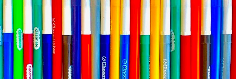

WWW
This image I think that it went really well because it is very symmetrical and the colours look very bold and bright due to the fact that the colour around it is a very beige and bland colour that makes the coloured pens looks even more colourful
EBI
I think maybe if all the pens were the same or the same brand then it would have looked better
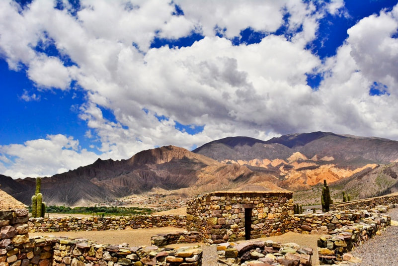
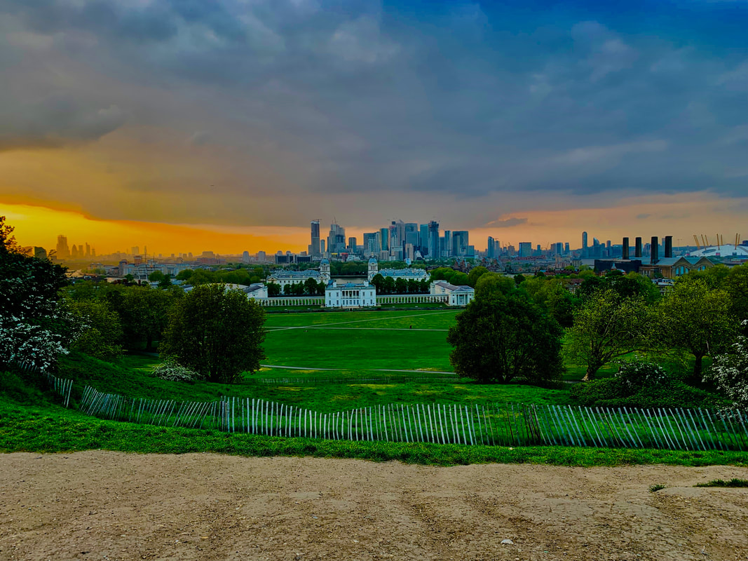
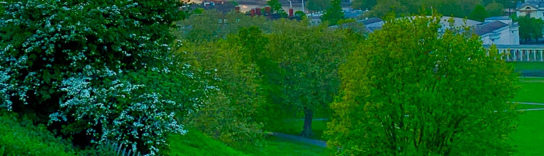
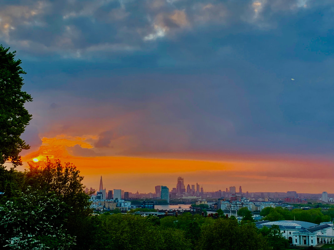
Daroo Ulises enviromental photography
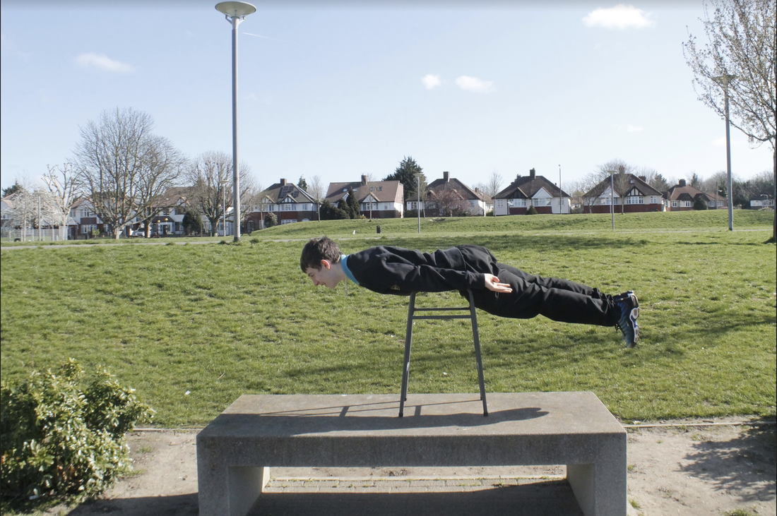
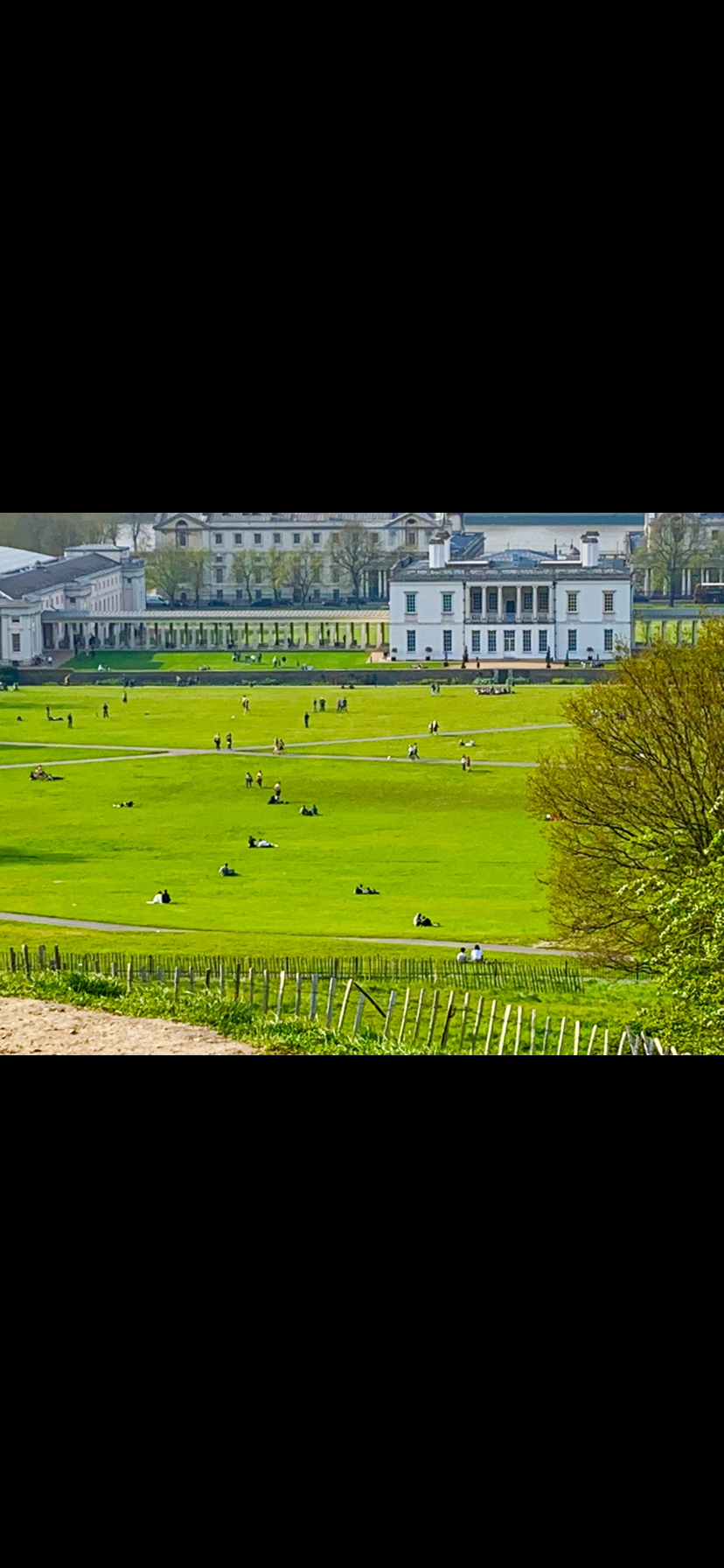
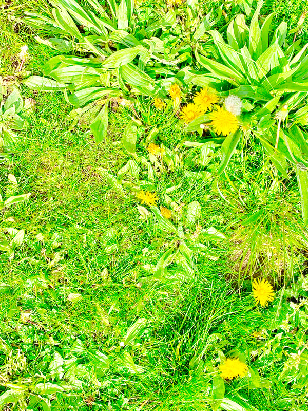
For these images I have taken environment into consideration as well as colour especially bright and colourful colours, like making the sky more saturated because in a lot of his landscapes they are very orange and saturated, I also made the grass and trees green and I like how all of the green colours manage to blend together, same with the sky how it all manages to turn slightly orange and saturated.
Another thing I have done here is use the buildings in the background to show the relationship between the natural world and construction, this is not necessarily a good thing in fact all the construction in the world is destroying nature and our world. However, some buildings and construction look nice and are designed to look aesthetically pleasing when put together with nature, take for example the building at the bottom the the hill in the first image, the building is built into the park and is made to look good and also not damage the natrual world.
Another thing I have done here is use the buildings in the background to show the relationship between the natural world and construction, this is not necessarily a good thing in fact all the construction in the world is destroying nature and our world. However, some buildings and construction look nice and are designed to look aesthetically pleasing when put together with nature, take for example the building at the bottom the the hill in the first image, the building is built into the park and is made to look good and also not damage the natrual world.
Martin Parr
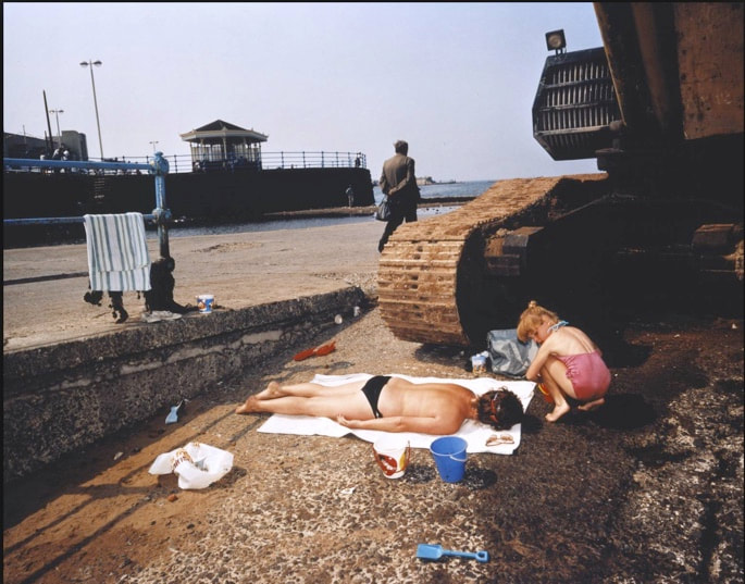
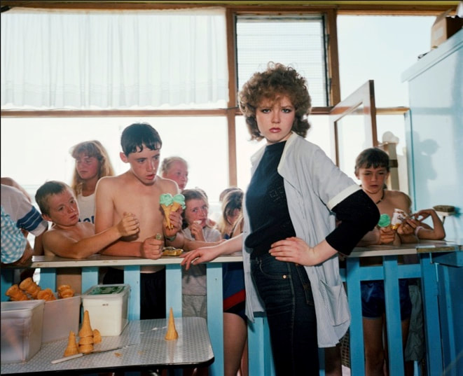
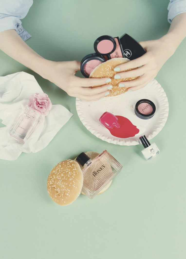
Martin Parr is a British photographer who does portraiture in different ways, he can go from having an extreme close up of a persons face to having a very far away taken picture of a group of people, his images usually involve people in one way or another. One technique including portraiture that Martin Parr uses is saturation, the image all the way on the right for example, is a very saturated portraiture, he almost makes his images look almost fake, this is because they look very 3D and warm, they are usually detailed as well, in a way that comes across very digital, this adds to the strange 'fake' vibe from the images. Another thing that he does is make pictures appear what you might call 'wrong' in the sense that he might take images of things in the wrong place and make things seem all out of place, take the image on the left for example, these people are dressed to go to the beach, are near the sea however, they are not on the beach they are almost behind it, next to a construction vehicle on some hard looking rocky ground, this almost seems to be a not only displeasing but unsafe place to be, especially with her child who looks fairly young, this is a very good example of his work which seems 'wrong'.
My images inspired by Martin Parr

These images are this time very much so in my own style with elements of Martin Parr, these being the use of saturation in portraiture and all of his images, I tried to take the saturation and portraiture side of this and take a couple of portraits that I really like in terms of saturation and the way that I edited them. I also attempted to take a recurring topic and theme in my images which is nature and I tried to take some very warm looking images or nature and look at the natural world. These images I think are about 70 percent my style and way of photography and 30 percent Martin Parrs photography style.
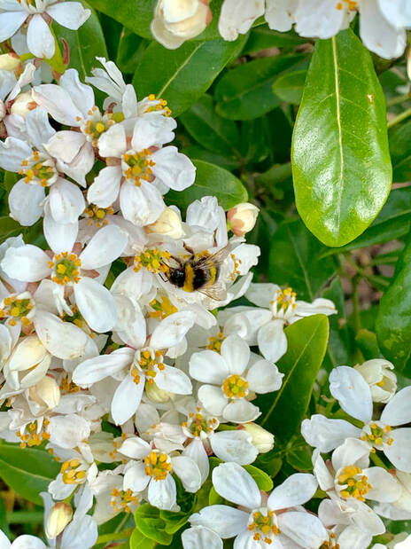
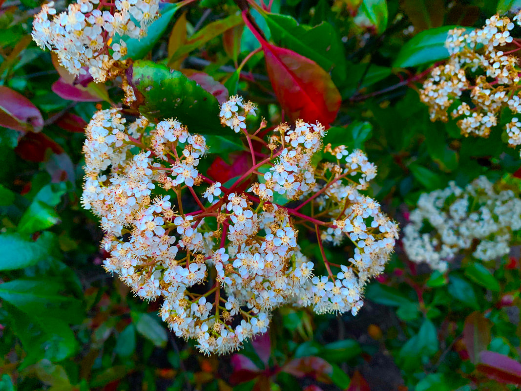
This image is my favourite that I have taken so far under the choice of colour, I think it is just a very hard image to capture as I had to go very close to this bee that was on the flower and make the image as good as it could be. I feel as if this picture is also really good because it has almost like highlights of yellow on the flowers and the bee, this is good because it shows how the colours blend and go together like the black and the yellow and the white and yellow.
Matt Russell
Matt Russell is a London based photographer, he has taken a lot of images, they tend to have experimentation in depth and detail, his images will show a lot of depth and have an extremely detailed foreground, this is a very interesting and aesthetically pleasing. Due to the quality and style of his images, he has gained a fair bit of popularity, often photographing food and drink and also people, his images have a certain atmosphere of the people not knowing he is there which is a very hard skill to have.
Matt Russell photography
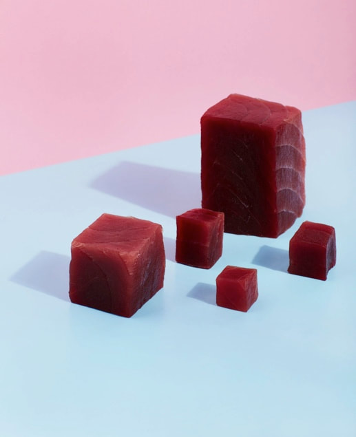
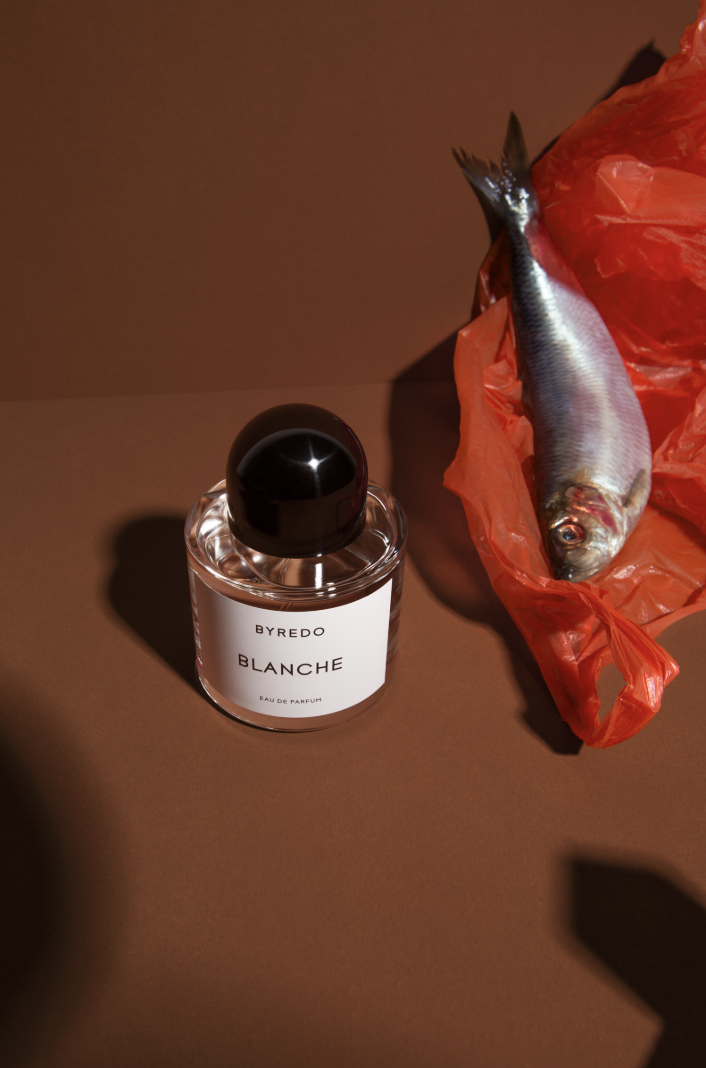
As you can see Russell's images have colours far from primary, he explores very warm and mature colours, unlike Daroo Ulises, who uses very childish colours in his photographs. These images are very commercial, almost like an advert, the images he takes are like very well presented food that is edited to look as nice as possible for people to go and buy food like that, this shows a different type of photography. His choice of colour is interesting as he is using very mature dark colours that people don't usually use to entice people however, surprisingly, people like it and it is being used on food, even though these images aren't associated with being nice things. I did not manage to take pictures like Matt Russell as I did not know where to start and also I really wanted an photographer who I only wrote about instead of taking pictures similar to them.
Jacob Reichschel
Jacob Reichschel is a pair of photographers who both come together to make 'perfect works of aesthetic harmony', balance is a very bold topic in their work, so no matter what they do they always come together to make something perfectly balanced in colour and objects. the colours that they use on the objects are vibrant and colourful but the colour they use in the background is usually a very creamy colour like baby blue or beige, this I believe is to bring out the vibrant colours even more than they already have. To put their images under a certain style I would call it modern, they almost look like covers to a very controversial magazine, these images I would say are the most individual and strange out of any artist under this topic.
Jacob Reichschel's images
These images are very good and there are a few things that I have noticed and like about them, the first thing being the technique that they always use a bland background so that the colours in the foreground are vibrant and noticeable, the images are always taken from a higher angle, almost at a birds eye view but not tall enough, just at a strange angle.
my images taken in the style of Jacob Reichschel
There is only two images here becuase taking pictures like these two is very difficult, in fact these two were taken by accident but I think that the angle is pretty spot on and the fact that the flowers are dotted around the grass is an interesting touch. The images that they take are very interesting and complex which is why maybe it is better to just do research on these two as what they do is so dedicated. What they do is described as a 'balance of colour and objects' which seems very strange to say but then again it doesn't because when you look at the pictures, it makes sense. those images are hard to even make when it is all your style of photography but these two were the closest I could get to it.
ideas log
.light and dark
.black and white
.shadows
.using more than one flash to make more shadows in different places
.getting another flash face it towards you in the middle of a nice picture and take a picture at the exact same time
.using mirrors
.making the corners of things meet the edge
.black and white
.shadows
.using more than one flash to make more shadows in different places
.getting another flash face it towards you in the middle of a nice picture and take a picture at the exact same time
.using mirrors
.making the corners of things meet the edge
Andy Warhol
Andy Warhol was one of the most influential figures not just in photography but all artistic subjects, he was one of the most famous artists ever and was extremely popular. His photography was usually portraiture, he took pictures of famous people in particular, people such as John Lennon and Muhammad Ali, his images have a very bland colour and beige colour to them but the images themselves are very interesting, in terms of the choice of colour he seemed to make one colour out if the whole picture.
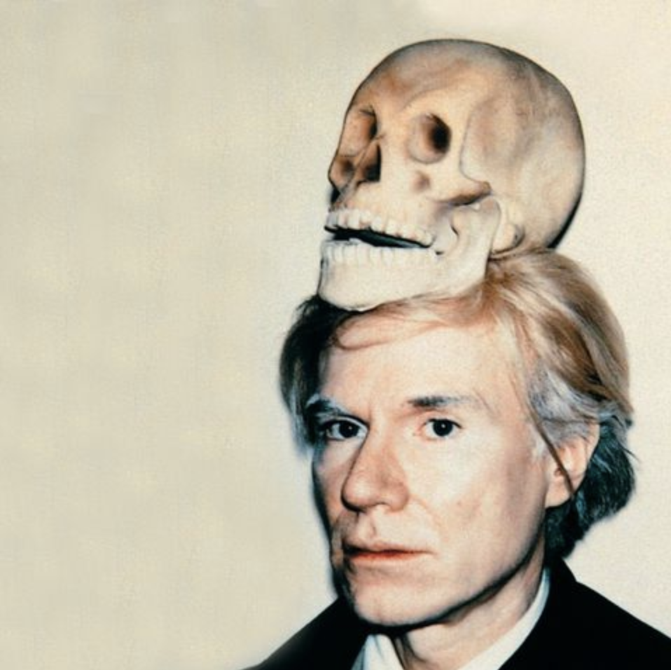
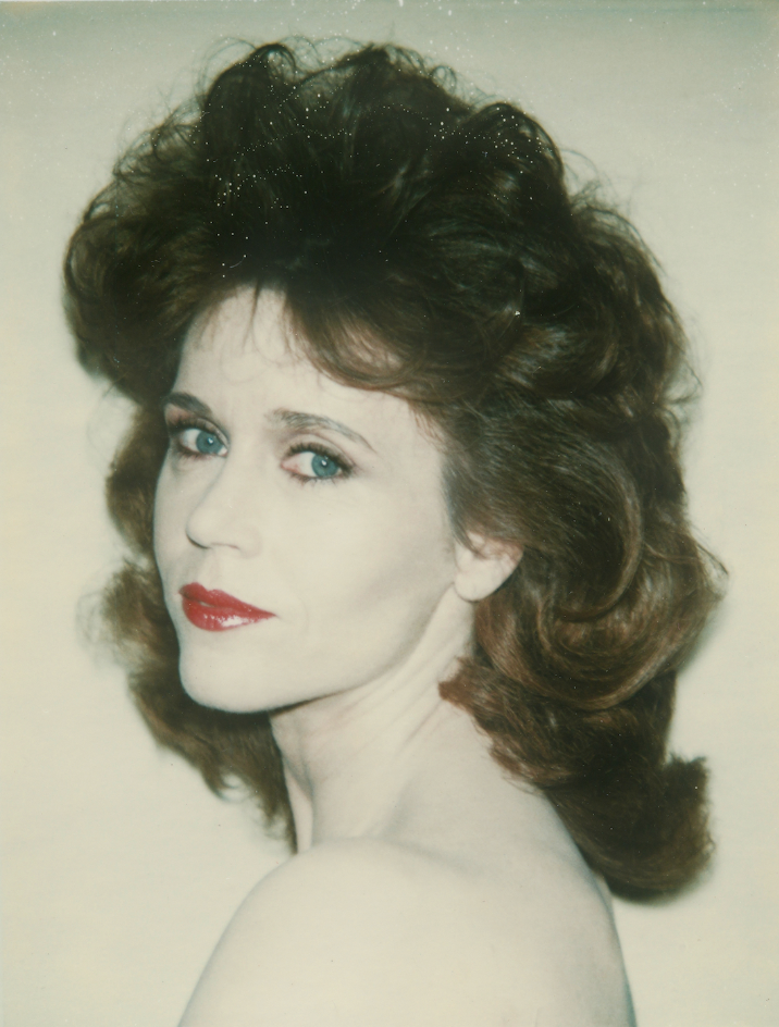
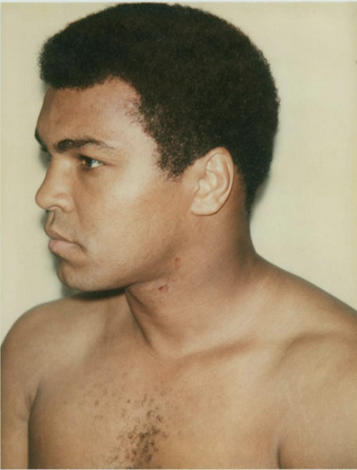
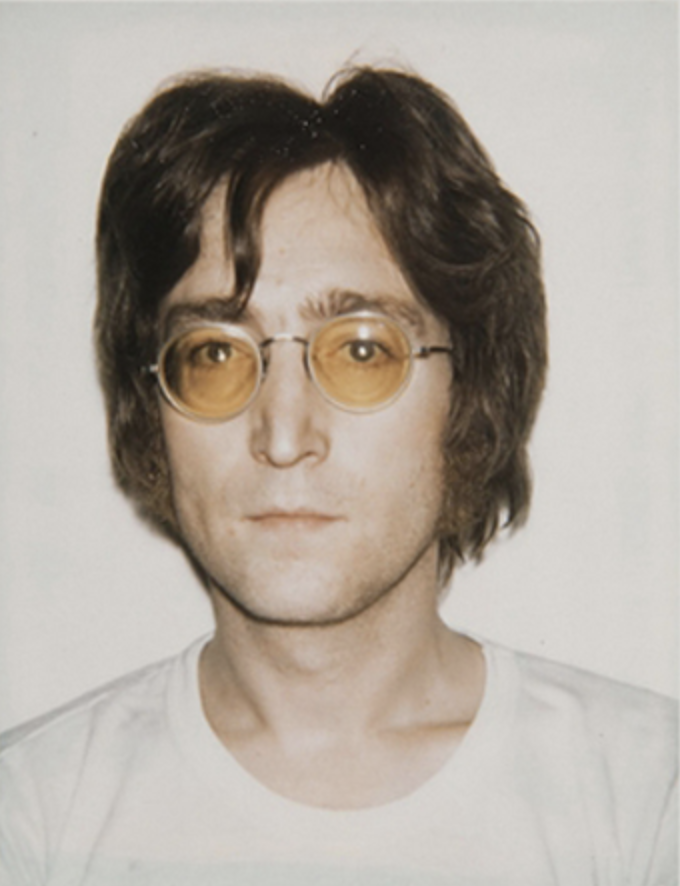
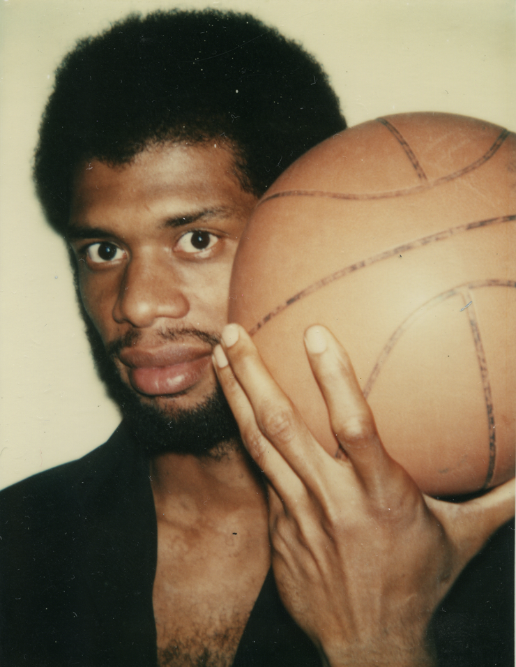
I can tell that with all of these images he had a flash on the camera he was using, this is interesting because at the minute I am exploring light and dark, this because I think that light can take a big role in colour and photographs under the topic of the choice of colour. All of these images tend to be not the best, set up photo shoot with the colours enhanced, I think that the point was he took these images on his own camera and they were polaroid, these images may be taken of famous people but the colour is so obvious and there, almost like natural colour of people and objects, without editing and high tech equipment.
My images inspired by Andy Warhol

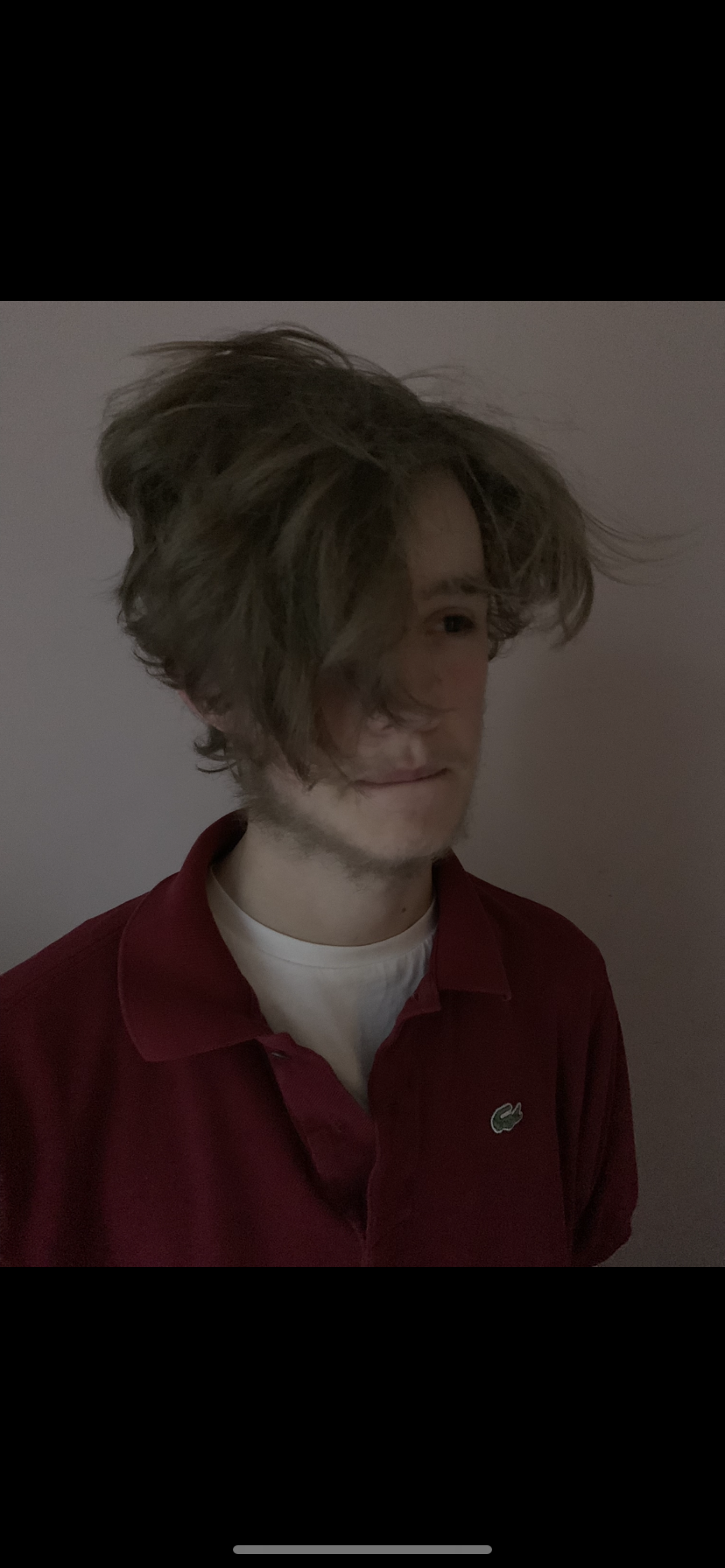
With this series of images I have experimented using different lightings, what I did was take pictures in different rooms with different lighting, for example, one room had a low hanging light and the other had a backdoor open. I also changed the colour settings so that the colours are less obvious and things like shadows are also more obvious and clear, I even tried making some of the photos black and white to see if that would work and if images need to be using a 'colour camera', and if you could study the choice of colour with light and dark, it is possible and does work, I plan on taking more pictures like this and making a gallery of them at some point. Playing around with the light and colour settings on the iphone is fun and I plan on doing it more. I took the style of Andy Warhols images and made them with strange editing and colours/lighting.
This is an image that I liked very much out of all the images in that series, I like it a lot because all I did to make it such a strange looking picture is to switch up the light and colour and the picture can pretty much become what you want it too.
Fan Ho
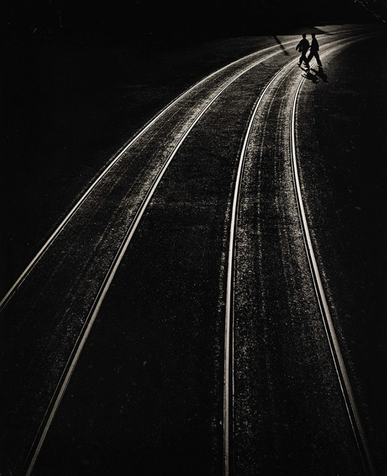
Fan Ho was a Chinese photographer who was very famous. He took pictures when there was no coloured cameras only black and white, however, the way in which he investigates light, dark, black and white is very interesting because he sort of highlights the white and light in an image but the dark or black is very deep and pitch, this makes the images look emotional and strong.
Fan ho photography
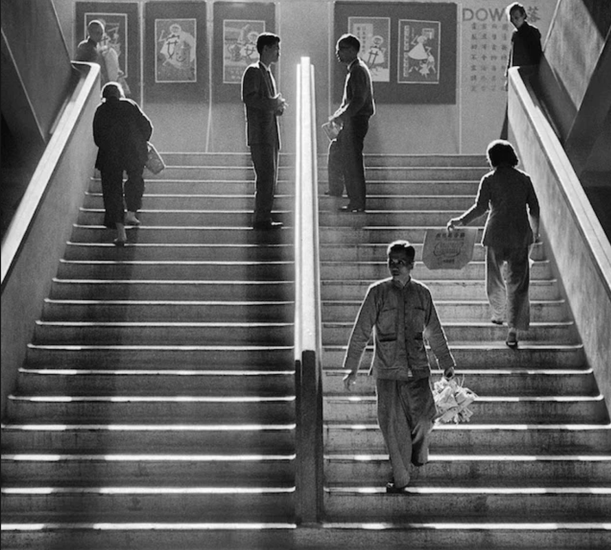
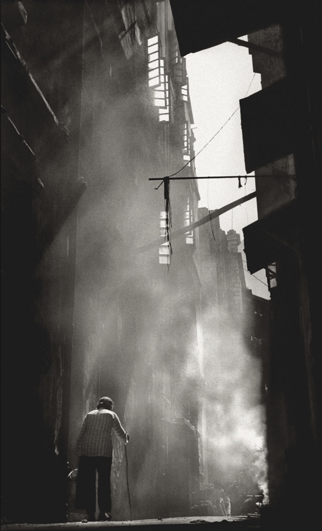
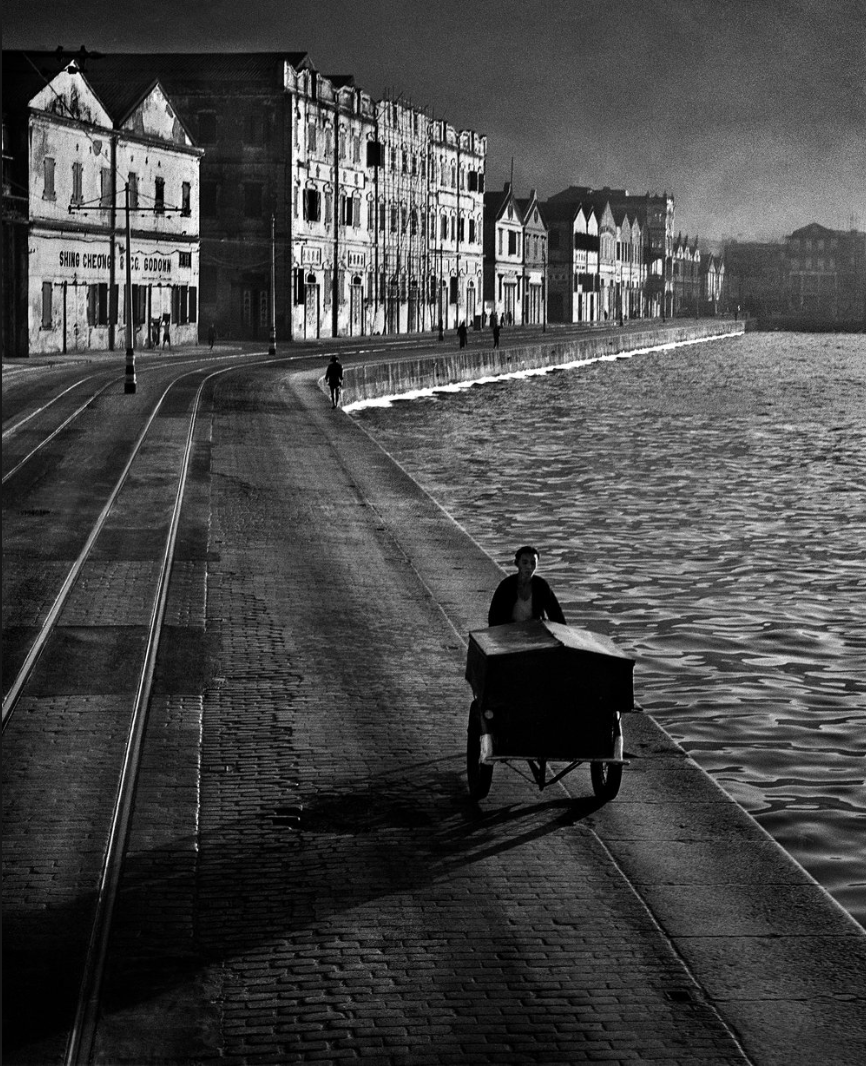
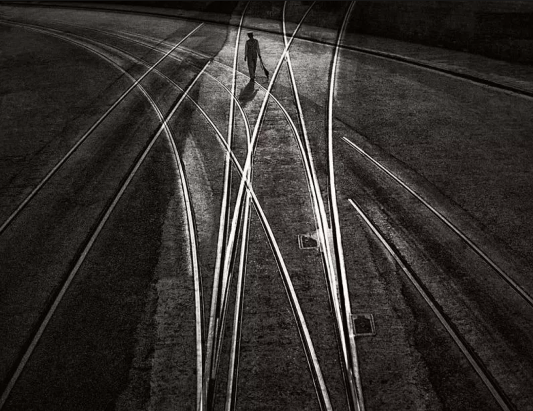
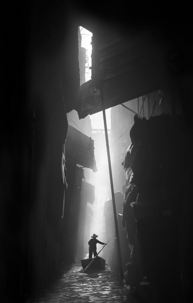
These images do show true emotions and and realistic depictions of the world, they could definitely have taken the choice of colour into consideration in these images, even though he doesn't have a coloured camera, he must have used the white and black to think about colour as some people do forget that black and white are colours too. I feel as if I could do the same so I am going to go and take some pictures similar to those that Fan Ho took, this is because I am interested into the history of colour in photography and how you can use black and white as well as a normal colour camera
my images inspired by Fan Ho
These are all images inspired by Fan Ho but also at the same time an investigation into light and dark and wether I could continue with the choice of colour in black and white, my experiment was successful, I don't really want to continue with just black and white however, to make my theme an investigation into black, white, light and dark, as this could be an interesting topic.
An investigation into light, dark, black and white
History of coloured cameras
when the coloured camera was first introduced, a lot of photographers were thinking that maybe they shouldn't use black and white anymore but there was loads of photographers thinking that coloured cameras were way too commercial, they thought they coloured cameras were used too much for adverts and that they make everything look commercial like you are advertising something. That is why I might try to take the most simple part of the choice of colour and that is the light and the dark which is what black and white pretty much is, I would somehow like to investigate black, white, light and dark without having to go to all my images being balck and white.
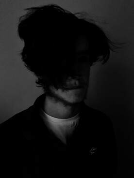
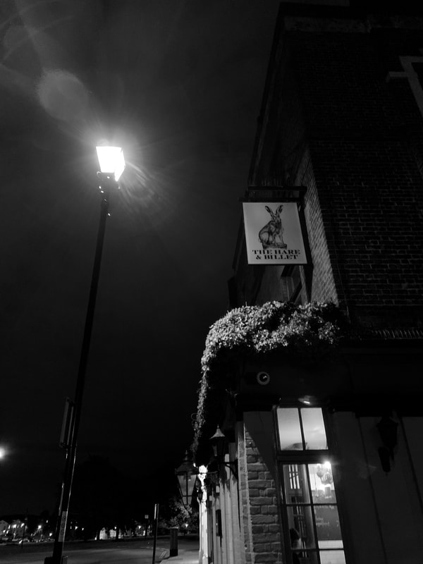
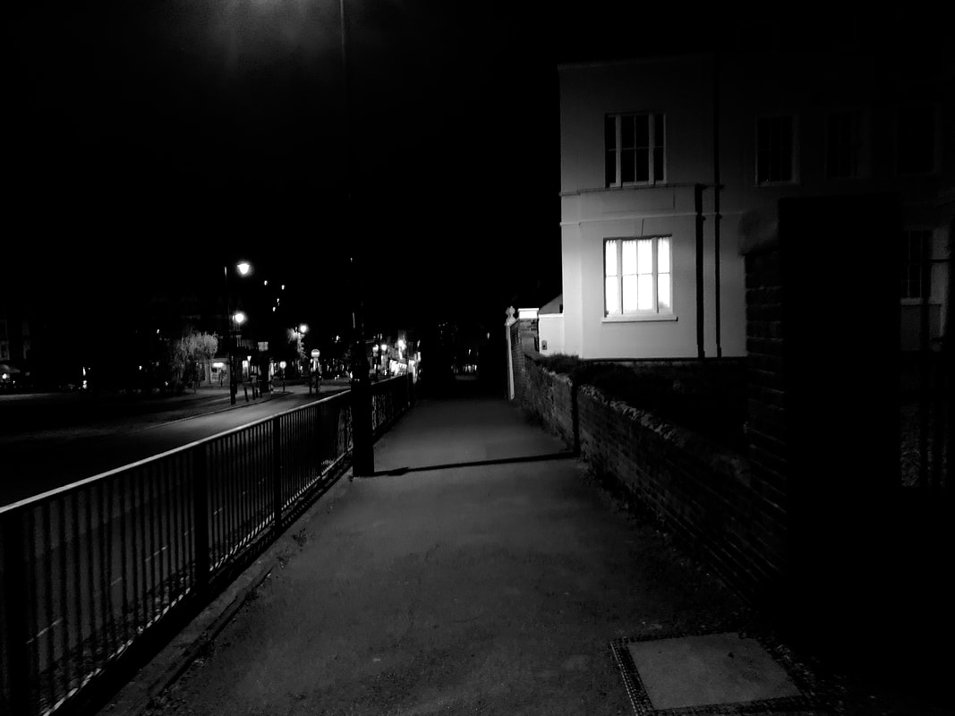
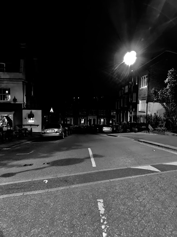
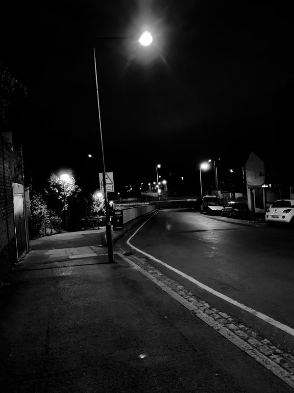
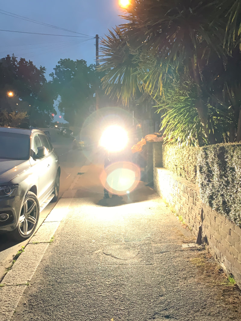
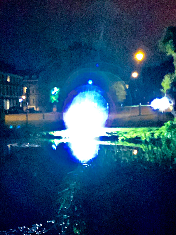
Images abstract lights and flashes
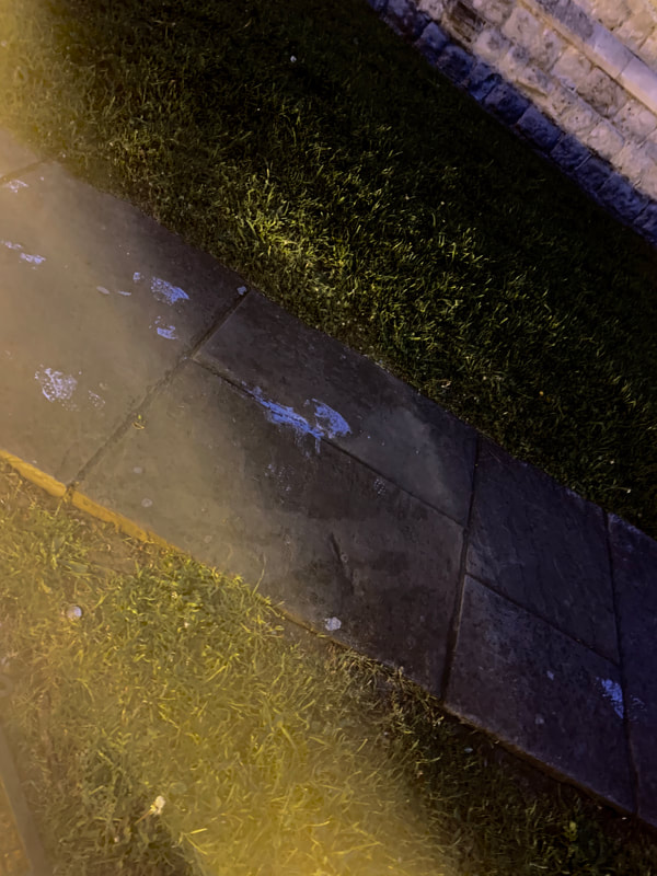
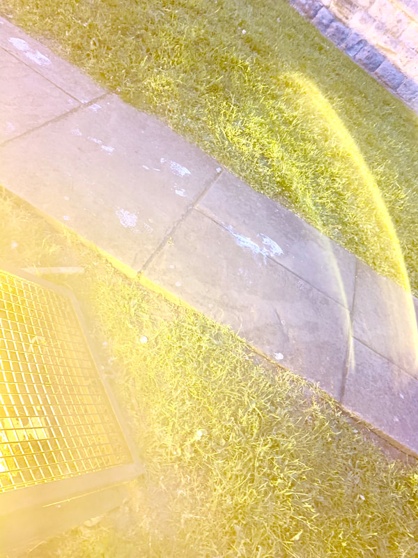
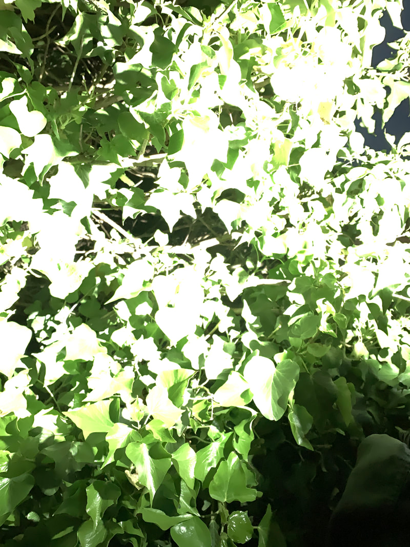
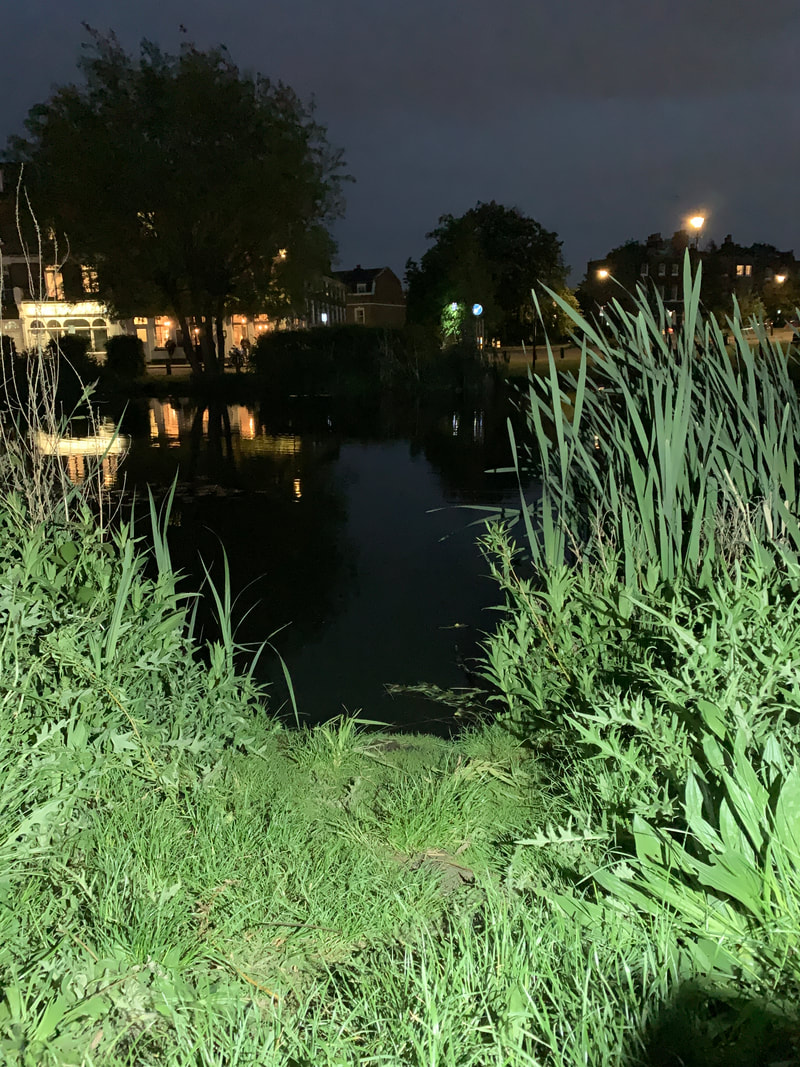
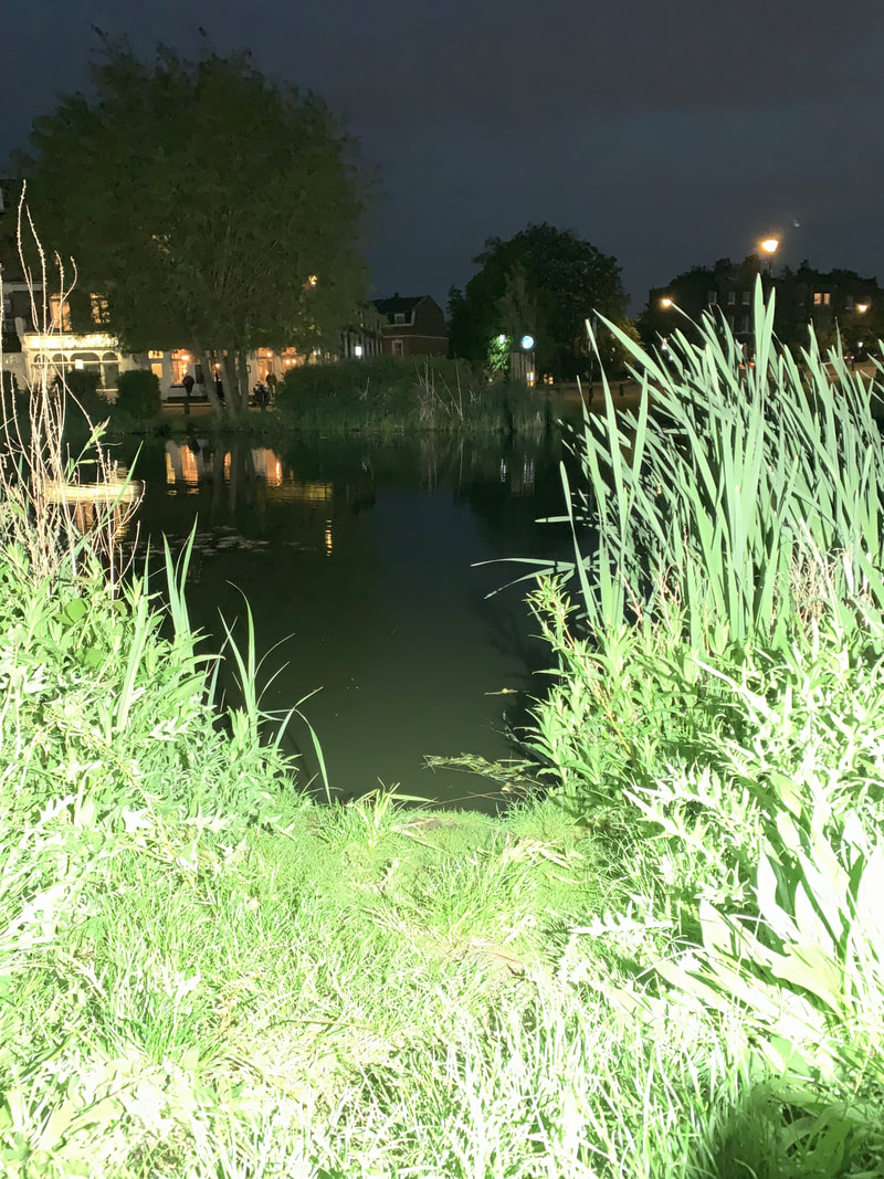
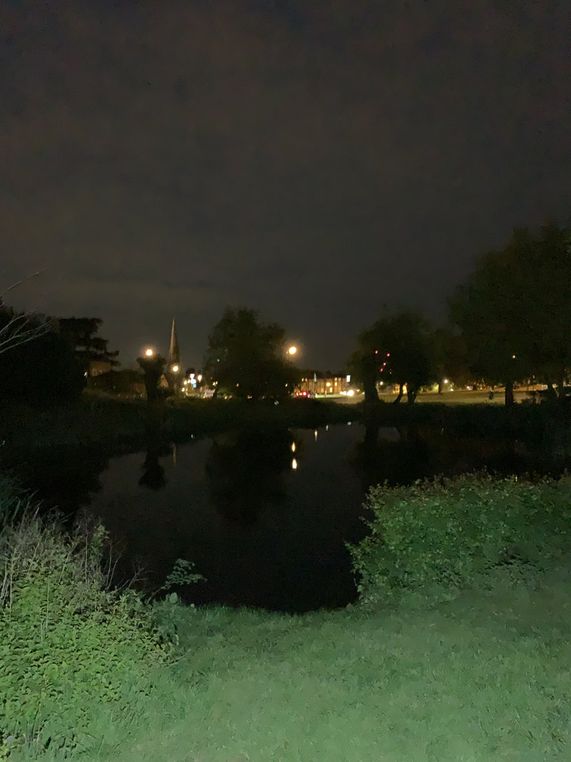
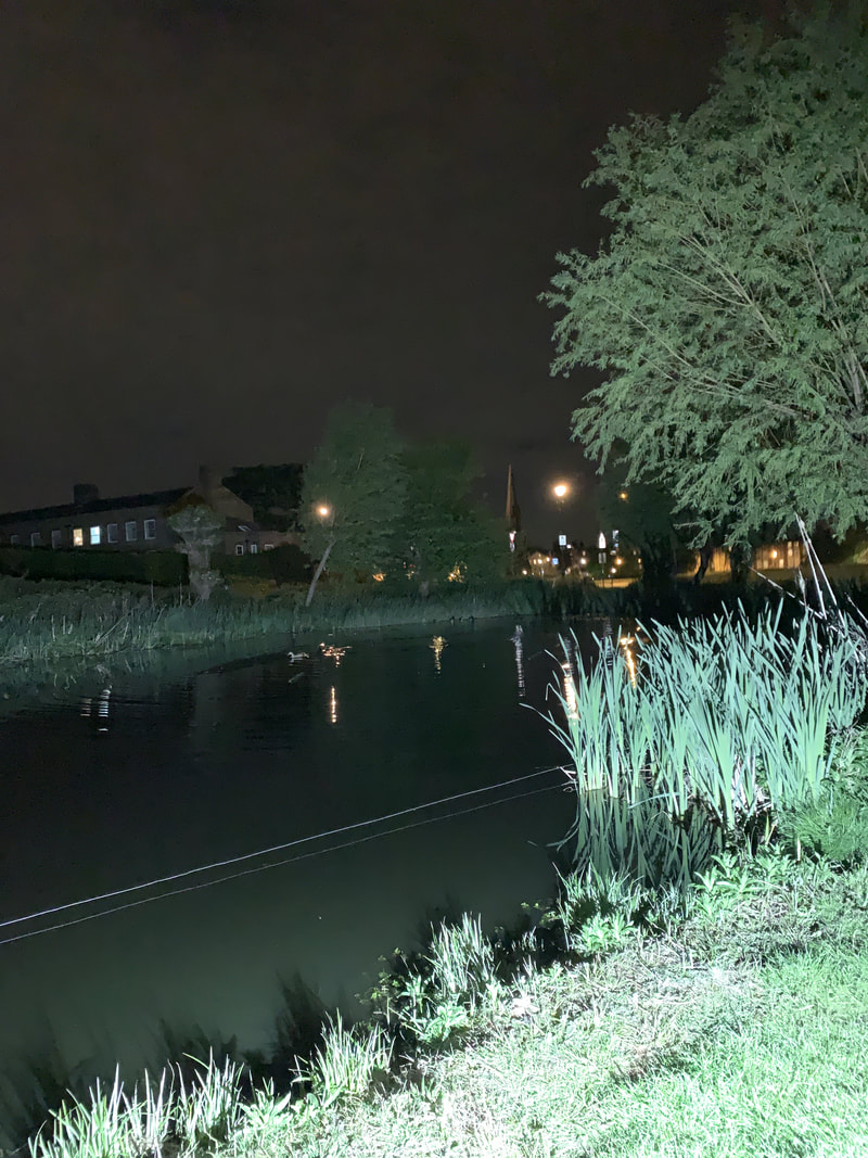
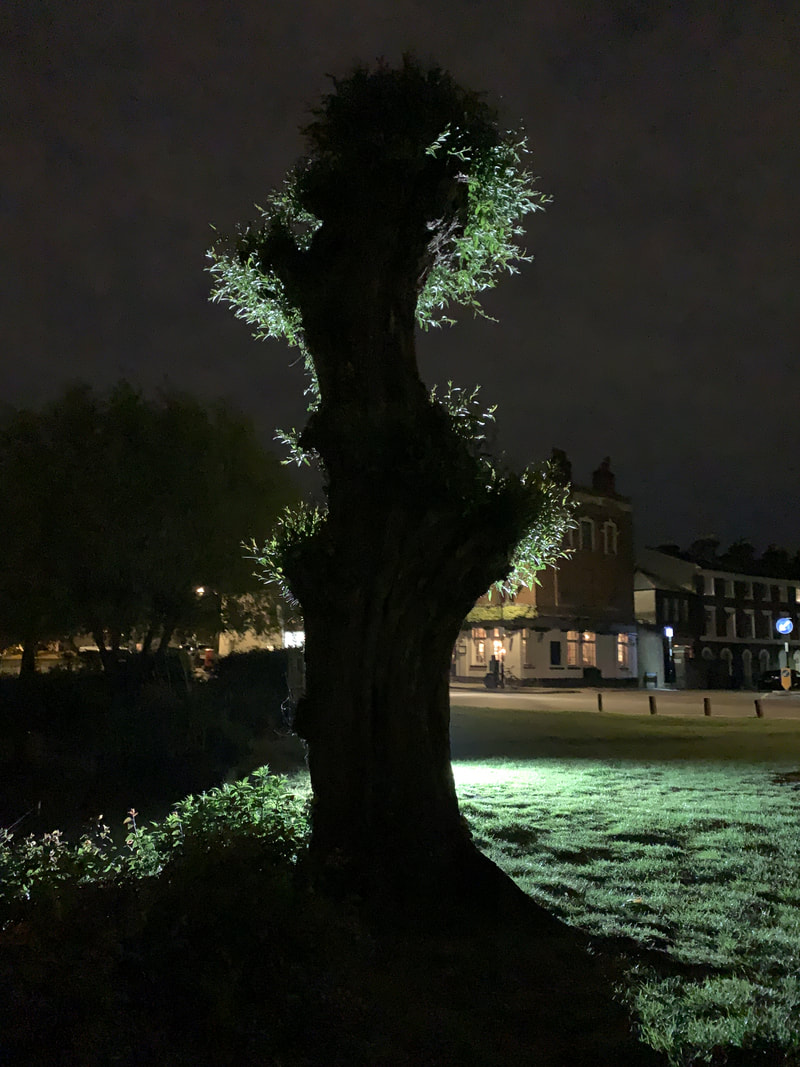
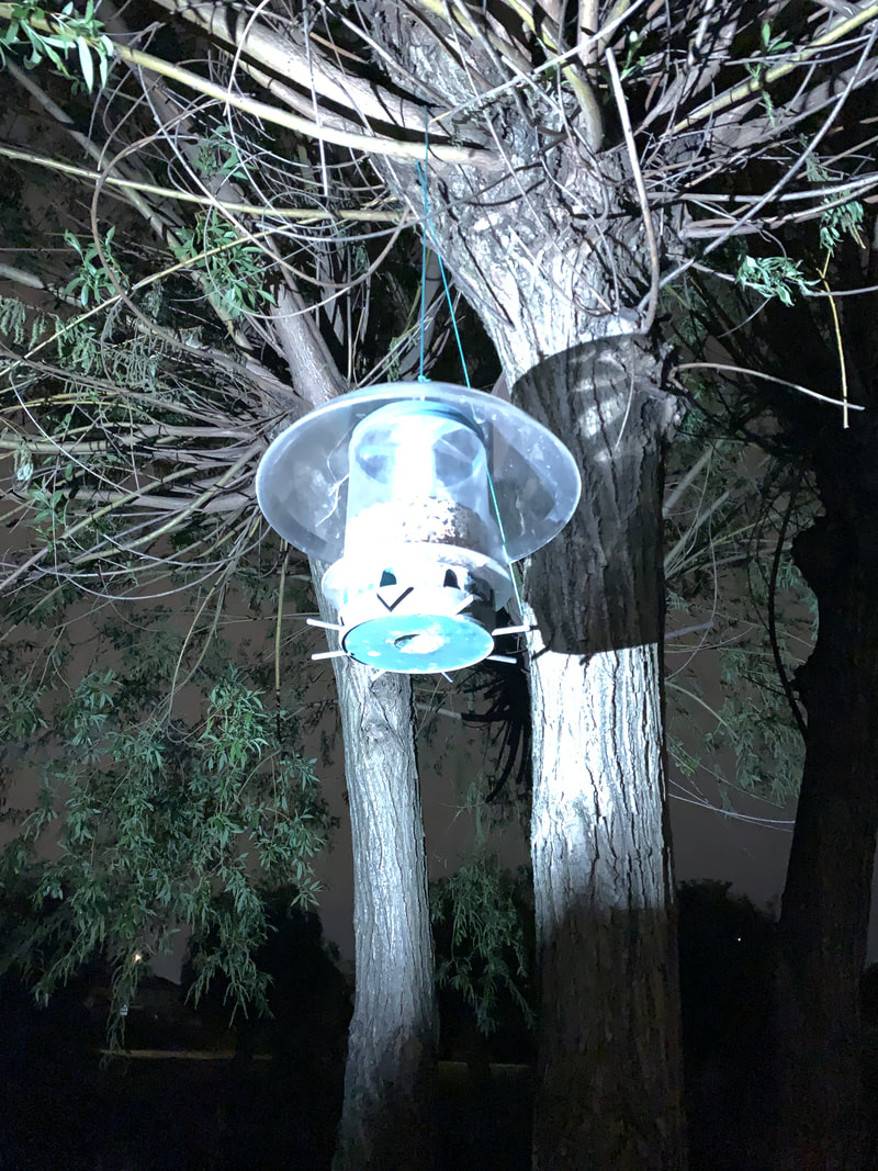
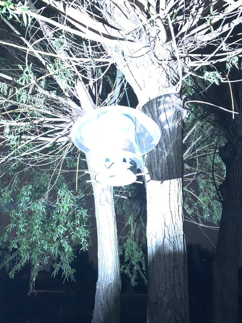
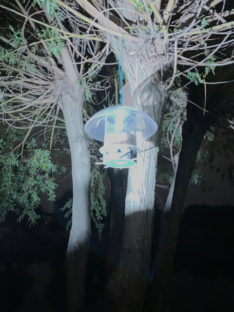
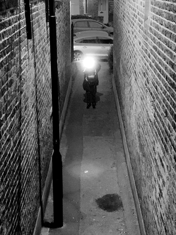
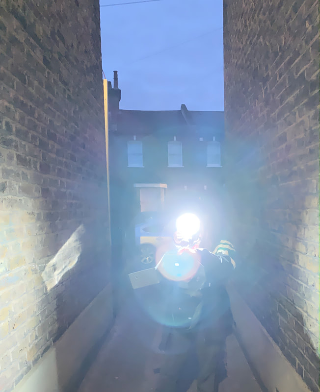
These are all images where I had taken light to make dark places look bright. During this experiment I took pictures in very dark places at night and then made them as bright as possible using the flash on my phone and another camera, some of the images may have come out very over exposed but that is the point, it looked like what it looked like because I was experimenting with the flash. Some of the images that are the best out of this gallery of images is the ones that behind where the flash has gone off and there is light up against it there is a shadow behind it. I think that using flash can be quite interesting
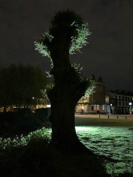
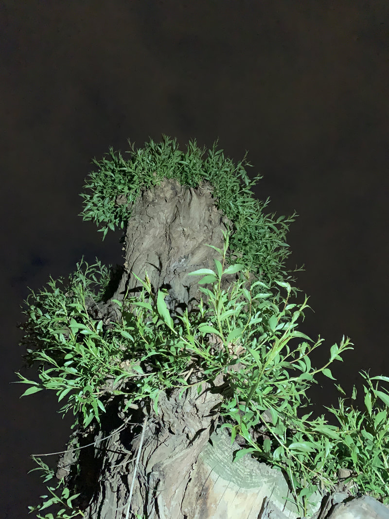
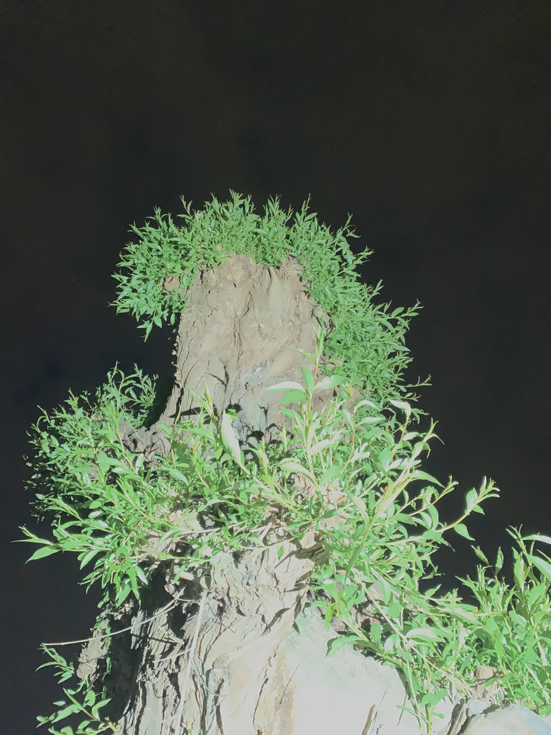
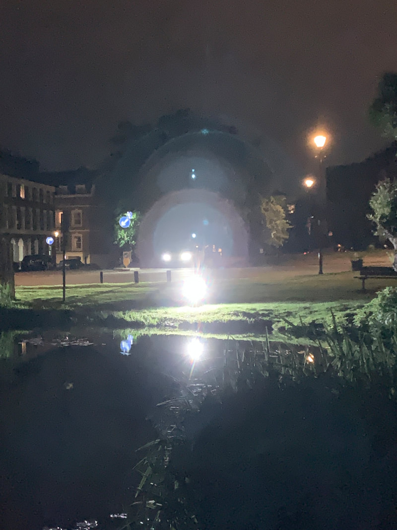
This is my favourite image out of all of them, I really like the lighting to this, it is very mysterious, the strange lighting especially when it involves a flash of very intense light. I like that I didn't put the black and white on this one because the green looks really good with the green at a really high colour towards where the flash is coming from then it gets darker, you can see this because of the shadows in the grass, the plants growing off the tree are green as well but they are a much lighter green. The colours change so drastically in this image, it goes from being intensely bright light that is making dark green almost white to the pitch black behind the tree, almost like a huge silhouette. This image shows both dark light, black and white all in one go so for me this is my favourite image that I have taken for this component so far. I think even without the flash behind it and the strange time of night I still find this tree interesting because it is an odd shape which is why I took so many without the flash being behind the tree, I like that there is just a spiral of leaves going round the outside of the tree with the broken, browny looking part of the tree in the middle, then of course if you shine a light then it casts this huge shadow, anyway this is my favourite picture so far
investigation into shadows
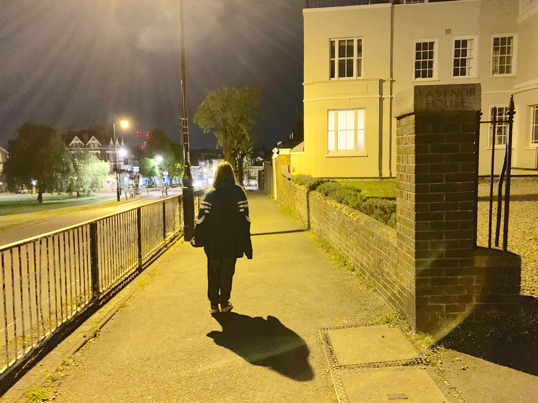
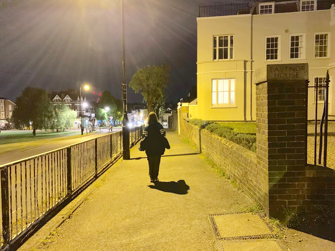
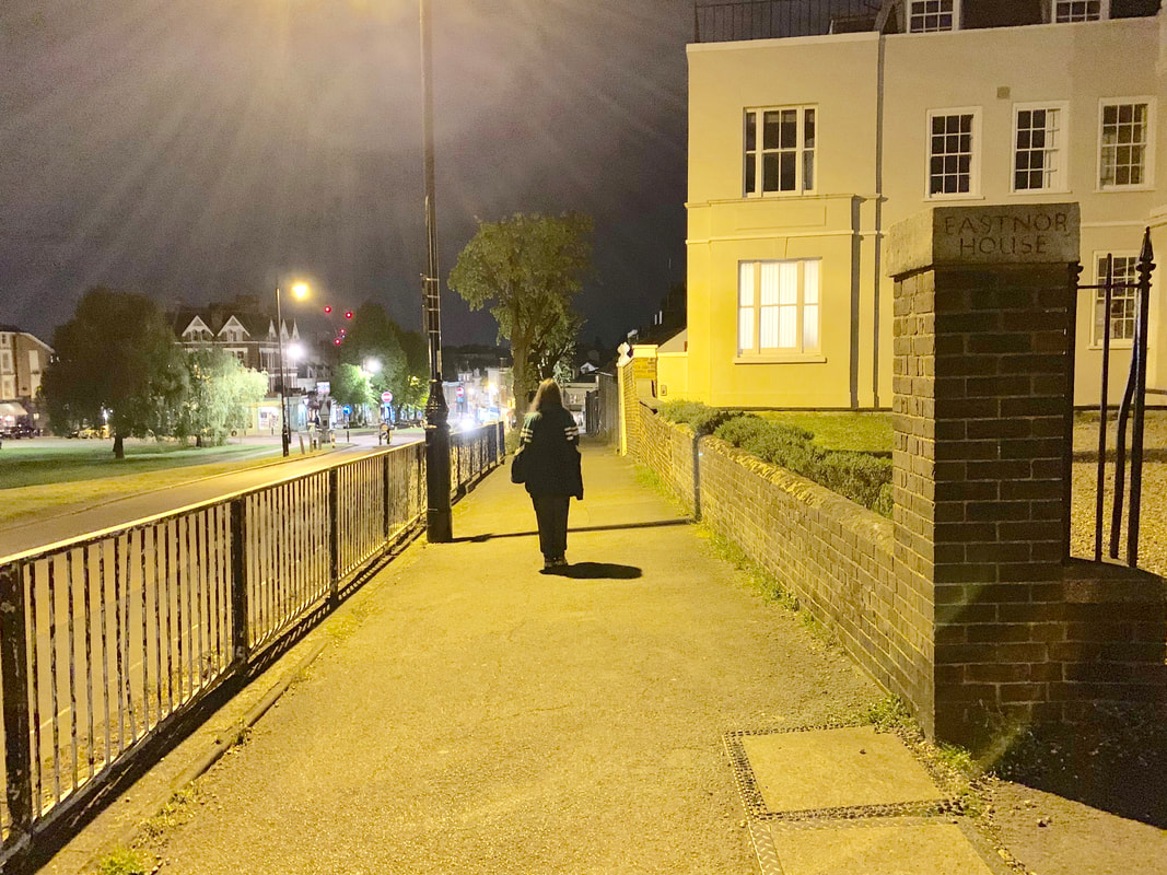
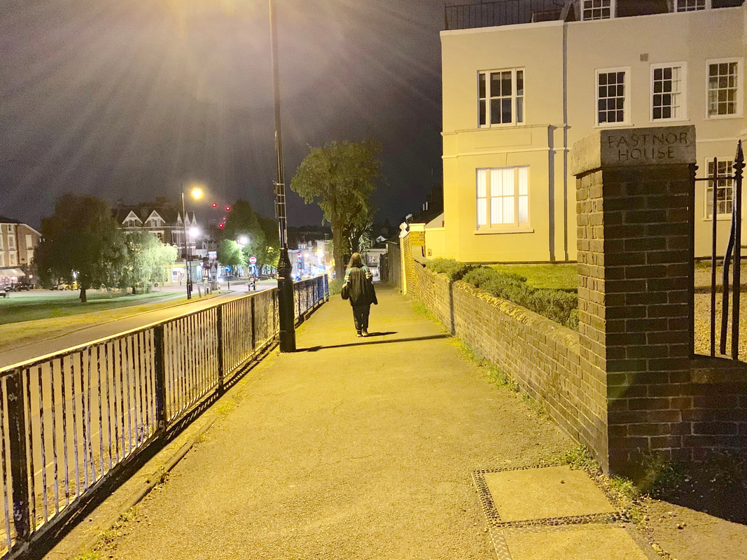
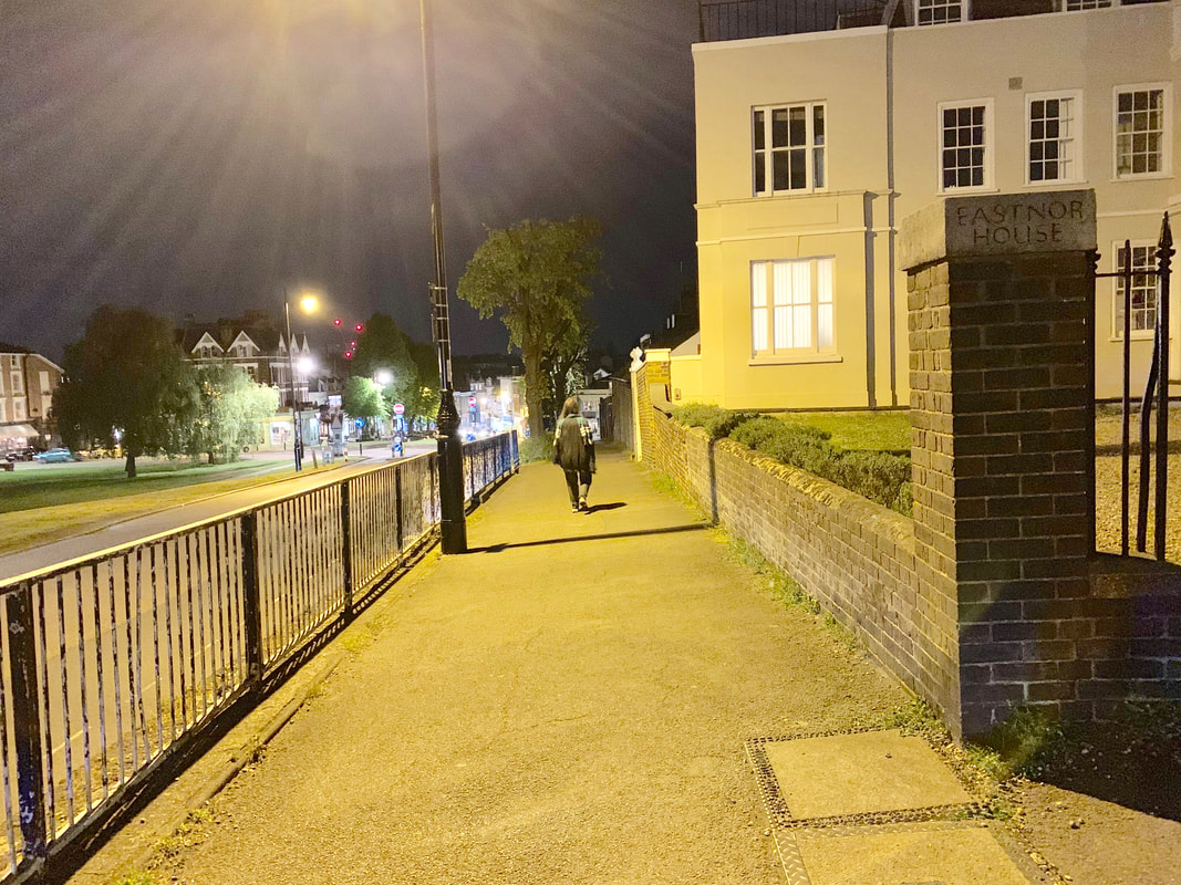
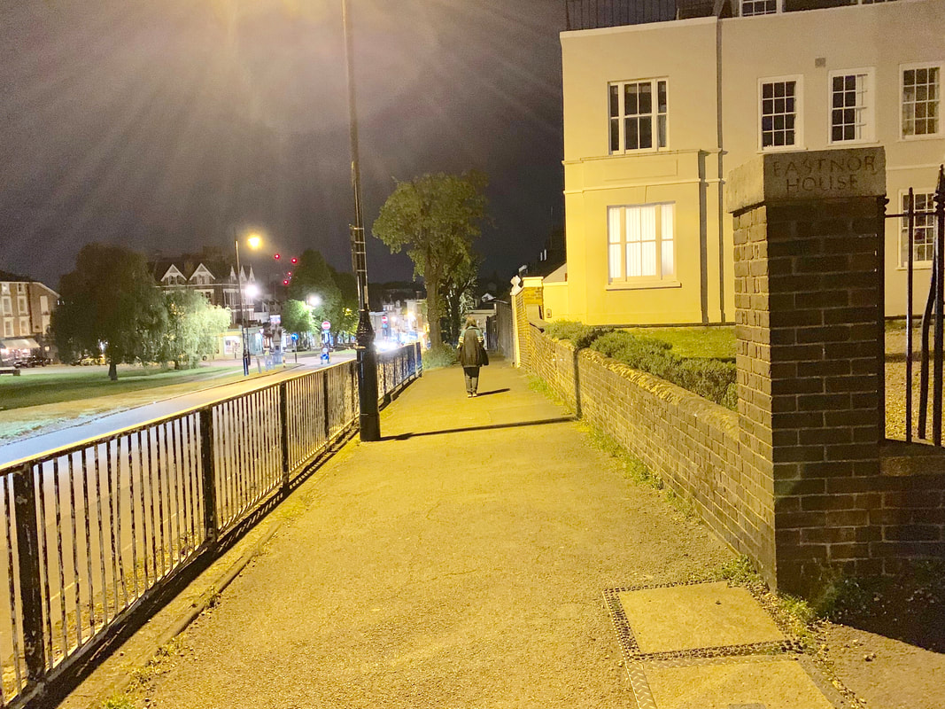
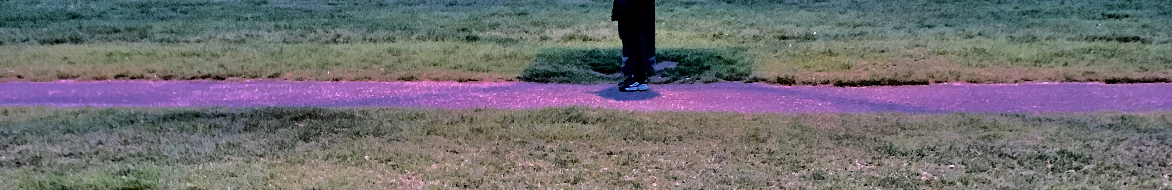
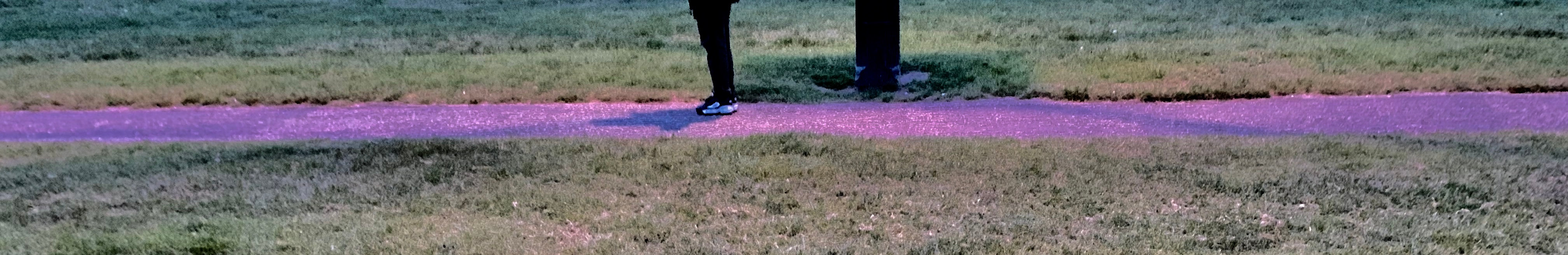
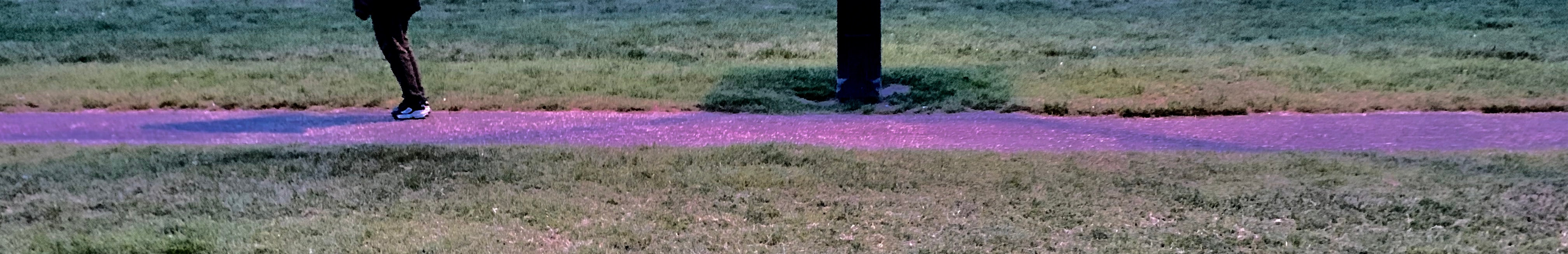
I these series of photos I got two different angles from what it looks like at two different times at night of a person walking past a lamp post and what their shadows look like as they progressively walk past.
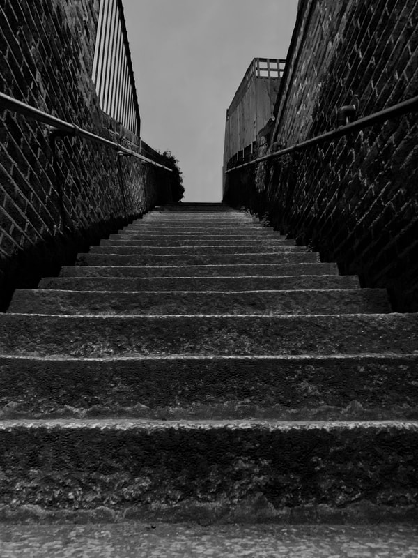
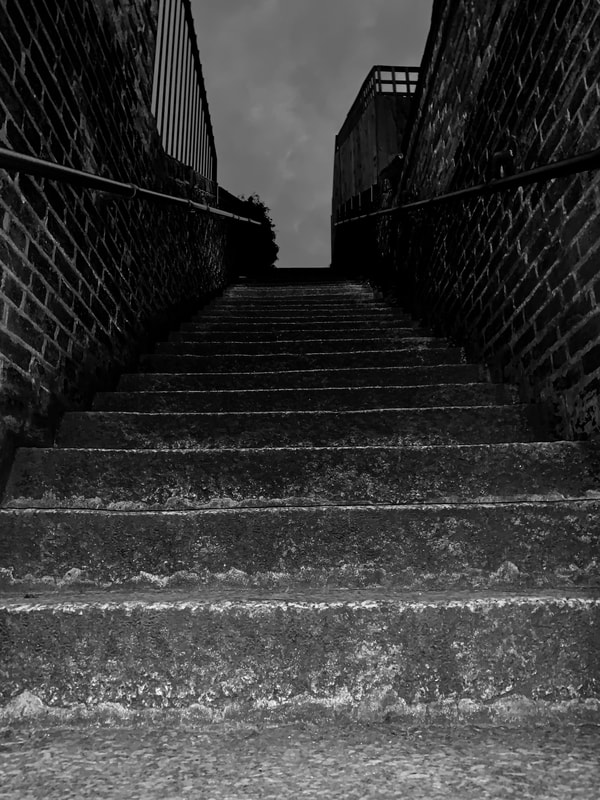
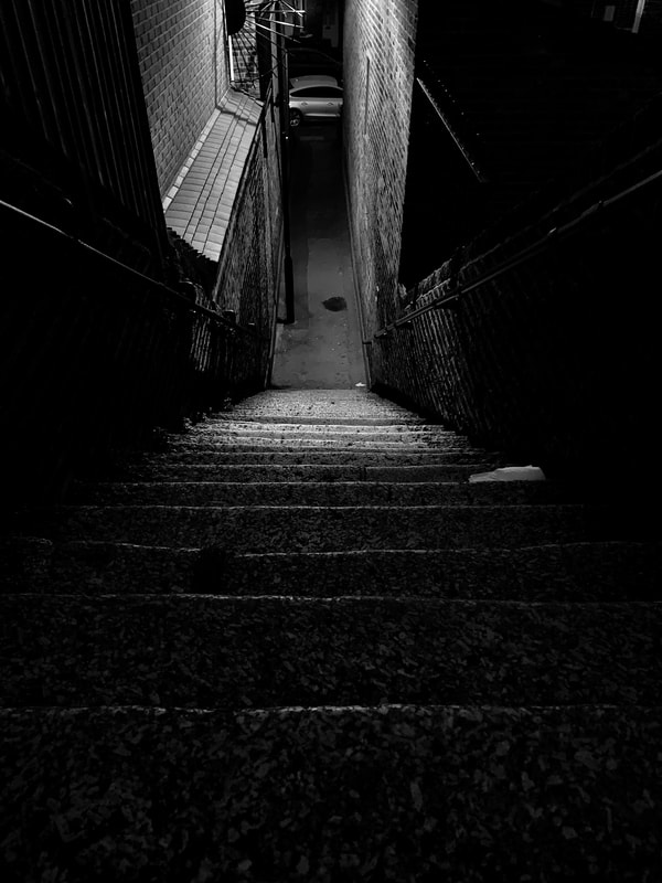
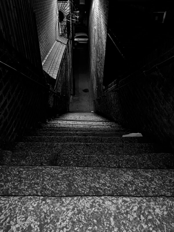
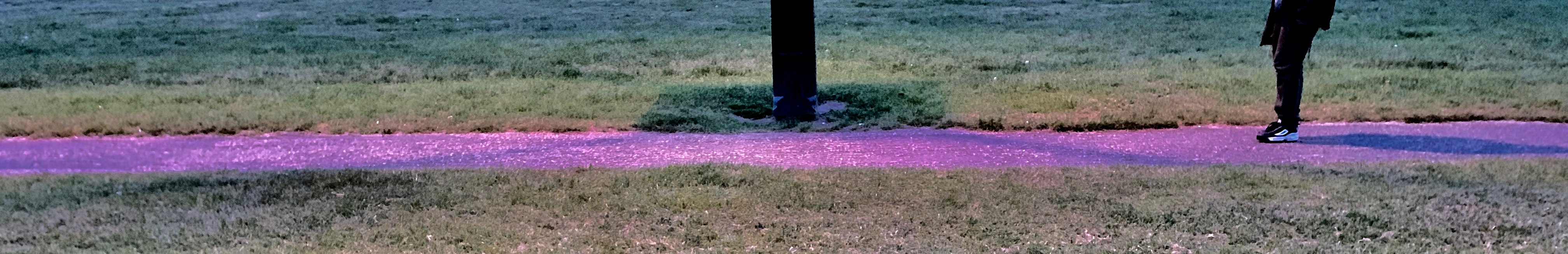
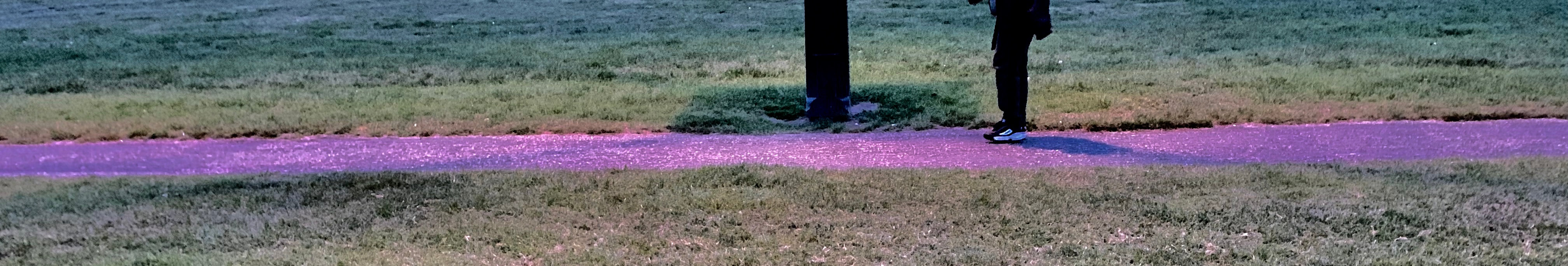
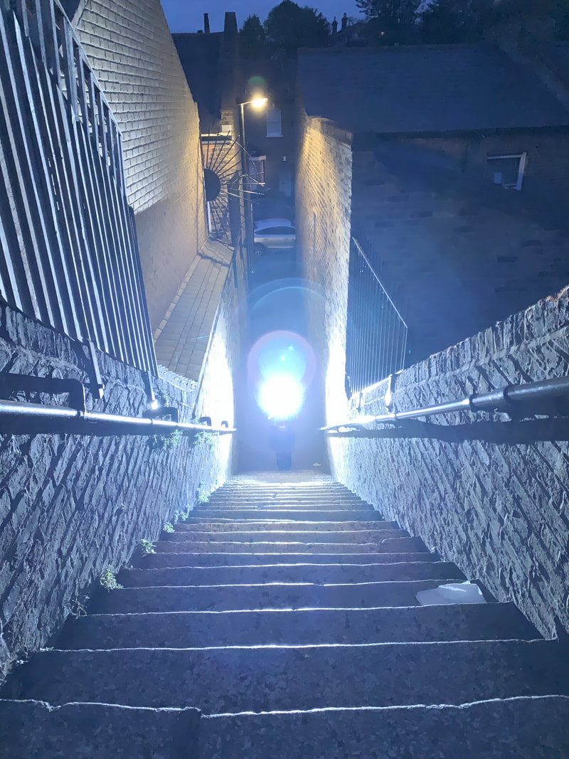
investigating how distance effects light and dark

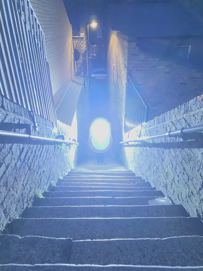
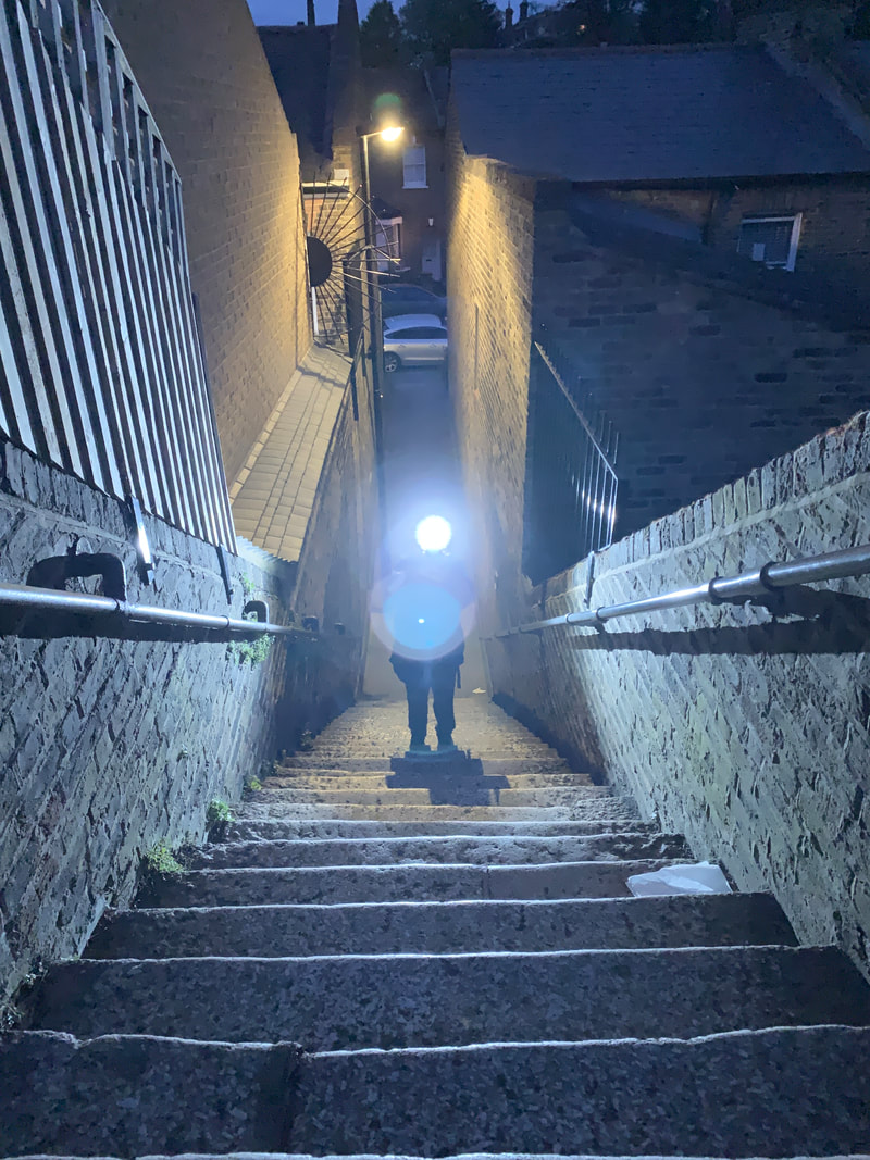
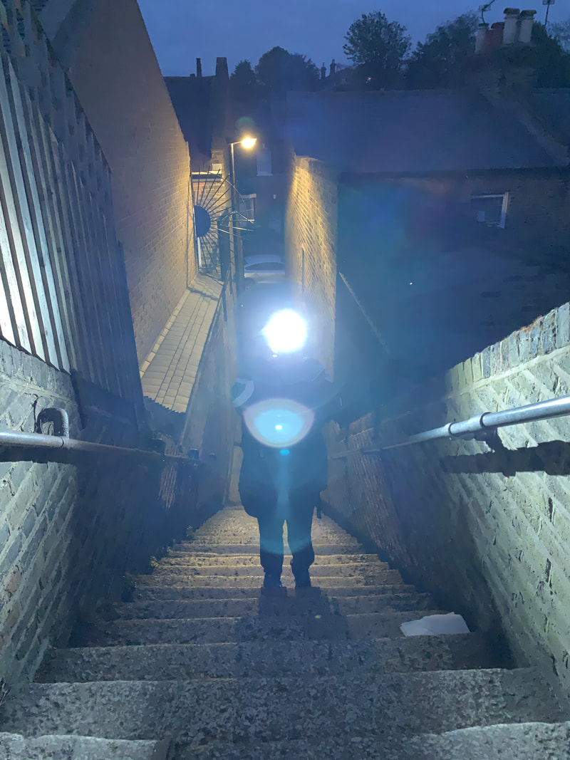
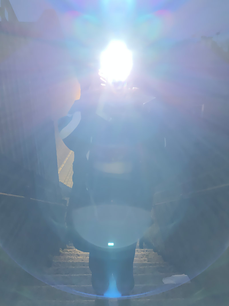
this was an experiment that I conducted to find out if distance effects the light in an image or what it might look like if it slowly cme towards you.
How did you conduct this experiment?
.First I found a long set of steps
.Then I sat at the top and told the other person to stand at the bottom
.I told them to take a picture towards me with the flash on with their professional camera
.I counted down from three and then told her to take the picture
.Whilst she took the picture, I turned my flash off and took a burst of pictures at the same time towards her
.Once I had done this I told her to take seven steps up (not for any particular reason) each time and then repeat
Videos related to my current experiments
Other images with flash facing towards camera
These are all images that I had taken in bursts with the other person facing towards me with the flash from their camera. This wasn't the experiment but it was to do with setting it up, this was just me messing around and trying to get some interesting images with editing and the flash.
How do I intend to use the ten hours?
What will I need?
.photographic paper
.the printer
.a mounting board
.paper
.laptop
I am going to mount some of the work that is on my USB stick, I am going to make a small gallery of my images with evaluation next to them and what I liked about them and what I didn't like about the images, this plan may change I might not be doing this, it is either this or a book where I will thread a book together and then stick my images in it and evaluate.
